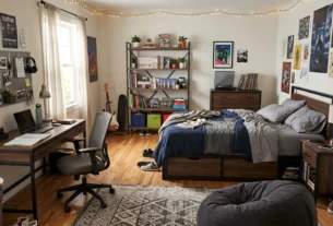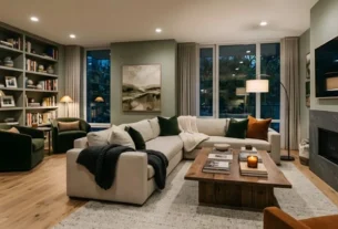
A warm neutral color palette for fall and winter 2026 centers on chocolate brown, supported by taupe, cream, caramel, and deep wood tones. Use brown as the foundation, add creamy lighter shades for contrast, and layer texture through wool, linen, and walnut. The result feels cozy, grounded, and more lasting than cool gray.
For more than a decade, gray set the tone in modern homes. Then rooms began to feel cold. Anyone who has sat under bright white walls on a dark November evening knows the problem. The space looks tidy, yet it does not feel like a place to settle in.
Designers have noticed. In the 1stDibs Interior Designer Trends Survey, 33% of respondents named chocolate brown as their top color for the year ahead, a share that has nearly doubled in a few years. That is a large shift for a shade many people wrote off as dated.
A warm neutral color palette built around brown solves the cold-room problem without making the house look heavy. It also works with different styles, from mid-century to modern organic. The trick is knowing which shades to combine, how light changes them, and where to use the darkest tones.
This guide covers the core colors, the reasons behind the shift, and how to apply the palette room by room. You will also find a checklist for testing paint at home before you commit.
Why Chocolate Brown Is Defining Fall/Winter 2026 Interiors
Chocolate brown is defining fall and winter 2026 interiors because it delivers warmth, depth, and a sense of quiet luxury that cool grays and stark whites cannot. Designers also like its staying power, since brown has a long history in interiors and rarely feels tied to one season.
The move away from gray is broad. Several 2026 trend roundups describe a shift from cool tones toward earthy ones, with brown, caramel, and taupe taking the place of gray and bright white. The same reports link the change to a wish for homes that feel calming and personal.
Brown as an Architectural Neutral
Brown used to appear mostly as an accent: a leather chair, a wooden table. In 2026 it is showing up on walls, built-ins, and cabinetry. Some retailers now describe it as an architectural neutral, meaning a color that anchors the whole room instead of decorating one corner.
Designers also point to its flexibility. Livingetc reports that many of the shades designers favor are blends of taupe, mole brown, and milk chocolate, including Benjamin Moore’s Taupetone and Farrow & Ball’s Broccoli Brown. These softer browns suit people who find true chocolate too strong.
Snippet answer: Chocolate brown is trending in 2026 because it adds warmth and depth to interiors and replaces cooler grays. Designers use it as a foundation color on walls, cabinetry, and large furniture, paired with cream, taupe, and natural wood.
Comfort Over Perfection
Interior designer Emma Shone-Sanders told Livingetc that people are pulling toward warm neutrals that feel comforting and easy to live with, such as caramels, mellow beiges, and chocolate browns. In the same piece, Kelly Hoppen noted that neutrals are getting more attention in 2026, pointing out that Pantone chose a white as its Color of the Year.
That detail matters. The trend is not about going dark for drama. It is about layering tones so that a room feels collected over time. A single brown sofa in a white room can look like a mistake. A full warm neutral color palette with several close shades looks intentional.
A Seasonal Fit
Fall and winter bring shorter days and more time indoors. Warm browns suit those months because they mimic the glow of candlelight and firelight. They also pair well with seasonal materials such as wool, velvet, and aged wood.
In spring and summer, you can lighten the same scheme by swapping dark throws for linen and adding fresh greenery. The base stays, and the layers change.
Building a Warm Neutral Color Palette: The Core Shades
A strong warm neutral color palette uses three layers: a deep base such as chocolate or espresso, a mid-tone such as taupe or camel, and a light shade such as cream or warm white. Accents in olive, ochre, or burgundy add life without breaking the calm.
Start with the base. Then choose supporting colors that share the same warm undertone. Mixing warm and cool undertones is the most common reason neutral rooms look off.
Chocolate and Espresso Brown
These are your anchors. Chocolate brown has a soft, milky depth. Espresso is darker and almost black in low light. Use them on walls for a cocooning effect, on cabinetry for contrast, or on large upholstery pieces.
Dark colors absorb light, so use them where you want intimacy: a den, a dining room, a primary bedroom. In small or dim rooms, limit them to one wall or to furniture.
Taupe and Mushroom
Taupe is the bridge between brown and gray. The warmer versions lean brown and feel richer than old-style gray-beige. Livingetc stresses that the current taupe is much warmer and brown-leaning than the lighter, gray-adjacent taupes of the past.
Mushroom tones work in the same way. They are good for walls in rooms where you want depth without the full weight of chocolate.
Cream, Ivory, and Warm White
Light shades give brown room to breathe. Choose creams with yellow or pink undertones rather than stark, blue-leaning whites. Warm whites on trim and ceilings keep the scheme soft, and creamy upholstery lifts dark walls.
Caramel, Camel, and Tan
These mid-tones add a glow. Think leather chairs, camel throws, and honey-colored wood. They connect the dark and light layers, so the room does not split into two halves.
Accent Colors That Work
Several colors sit naturally beside brown:
- Olive and deep green: earthy and calming
- Burgundy and merlot: rich, with a hint of jewel tone
- Ochre and mustard: sunny contrast in winter
- Heritage blue: a cool counterpoint that keeps the room from feeling flat
- Terracotta and rust: warm and slightly retro
Retail trend guides for fall 2026 list chocolate brown, burgundy, olive green, heritage blue, ochre, mushroom, and cream among the season’s key colors. Treat these as one trend report among several, and choose what suits your home.
| Layer | Example Shades | Role in the Room | Where to Use It |
|---|---|---|---|
| Base | Chocolate, espresso, deep walnut | Anchors the space | Walls, cabinetry, large sofas |
| Mid-tone | Taupe, mushroom, camel, caramel | Connects dark and light | Rugs, chairs, curtains, leather |
| Light | Cream, ivory, warm white | Adds contrast and brightness | Trim, bedding, upholstery |
| Accent | Olive, burgundy, ochre, blue | Adds personality | Cushions, art, ceramics |
Pro tip: Aim for a balance close to 60% mid and light tones, 30% brown, and 10% accent. This classic proportion keeps a brown room from feeling heavy.
How Light Changes a Warm Neutral Color Palette
Natural light changes how every neutral looks. North-facing rooms get cooler, flatter light that can make browns look darker and grays look bluer. South-facing rooms get warmer light that deepens browns and can make creams look yellow. Always test paint in your own room before committing.
The most useful number for this is Light Reflectance Value, or LRV. Homebuilding explains that LRV measures how much light a paint color reflects, from 0 for absolute black to 100 for pure white. Chocolate and espresso sit at the low end, so they absorb light. Cream and warm white sit at the high end.
Snippet answer: Light Reflectance Value (LRV) is a scale from 0 to 100 showing how much light a paint color reflects. Dark browns have a low LRV and absorb light, while creams have a high LRV and bounce it around the room.
Room Orientation Guide
| Orientation | Light Quality | Effect on Browns and Neutrals | Suggested Approach |
|---|---|---|---|
| North-facing | Cool, indirect | Browns look heavier, grays look bluer | Choose warm undertones and add lamps |
| South-facing | Warm, bright | Browns glow, creams may look yellow | Use deeper shades confidently |
| East-facing | Warm morning, cool afternoon | Colors shift through the day | Test at several times |
| West-facing | Cool morning, golden evening | Warm tones intensify at dusk | Test in the evening |
An interior designer quoted by Homebuilding says that a north-facing room tends to have cooler, flatter light, so warmer colors can look beautiful there. That is useful if you want to try a brown scheme in a darker room. Warm undertones balance the cold light.
How to Test Paint Before You Commit
- Buy sample pots. Swatches in small cards cannot show how a color behaves.
- Paint large boards. Use at least two-foot squares on lining paper or primed board.
- Move them around. Place boards on different walls, including shaded corners.
- Check at different times. Look in morning, midday, and evening, plus under lamps.
- Compare with your furniture. Hold fabric and wood samples beside the board.
- Wait a few days. First impressions often change.
This process takes time but costs far less than repainting a room.
Artificial Light Matters Too
Warm bulbs around 2700K to 3000K flatter browns and creams. Cool white bulbs can make the same colors look gray and flat. Layer lighting with floor lamps, table lamps, and picture lights rather than relying on one ceiling fixture. A deep brown library with warm picture lights can look luxurious, while the same room under harsh overhead light looks dull.
Using a Warm Neutral Color Palette Room by Room
The best way to use a warm neutral color palette is to match depth to purpose. Use darker browns in rooms for rest and gathering, and lighter mixes in rooms that need brightness for tasks. Repeat two or three colors across rooms so the home feels connected.
Living Room
The living room is where brown has the most impact. Consider a taupe or mushroom wall with a chocolate sofa, cream curtains, and a walnut coffee table. Add a wool rug in oatmeal or camel to soften the floor.
For a bolder approach, try color drenching. This means painting walls, trim, and sometimes the ceiling in the same shade. Some 2026 trend lists note that color drenching creates a cohesive, immersive atmosphere. It works best in rooms with good light or in cozy spaces that you use mostly in the evening.
Bedroom
Brown suits bedrooms because it calms the eye. A velvet chocolate headboard against a pale wall is a simple option. Pair it with white or cream bedding, linen curtains, and bedside lamps with warm shades.
Keep contrast moderate. If everything is dark, the room can feel heavy. A single lighter layer, such as a cream throw or pale rug, helps.
Kitchen and Dining Room
Dark wood cabinetry, espresso islands, and walnut shelving are all part of the 2026 look. Pair them with light countertops or stone with warm veining. In a dining room, a deep brown wall with a cream tablecloth and brass lighting looks inviting for winter dinners.
Bathroom and Entry
Small spaces suit bold color because you spend little time in them. A chocolate-painted entry with a mirror and warm sconces creates a welcoming first impression. In bathrooms, warm taupe tiles and walnut vanities give a spa-like feel.
Home Office
A brown library look has appeal for work rooms. Deep walls, wood shelves, and a warm desk lamp support focus. Keep a lighter rug or chair to avoid a closed-in effect.
Materials and Textures That Make the Palette Work
Texture keeps a warm neutral color palette from looking flat. When colors sit close together, surfaces provide the contrast. Combine matte, soft, rough, and glossy finishes, and mix natural materials such as wood, wool, leather, and stone.
Livingetc notes that 2026 is a year of tactility drawn from nature, meaning neutrals should engage the senses as well as the eyes. That idea explains why so many brown rooms rely on materials more than on pattern.
Wood
Walnut, oak, and teak add warmth. Choose one main wood tone and repeat it. Mixing too many wood shades can look messy, though two close tones work when they share an undertone.
Textiles
- Wool and boucle: soft, with visual depth
- Linen: relaxed and light
- Velvet: luxurious, especially in chocolate or olive
- Leather: classic and long-lasting
- Cotton and jute: natural and casual
Layering rugs, throws, and cushions adds richness without changing the paint.
Stone and Metal
Travertine, marble, and limestone pair well with brown because they share earthy origins. Brass, bronze, and aged gold add a soft glow. Avoid chrome, which can look cold against deep brown.
Pattern in Moderation
Retro-inspired motifs are returning in brown textiles, with wide stripes and spots appearing in some retail collections. Use pattern sparingly. A striped cushion or a spotted throw adds interest without competing with the palette.
Common Mistakes With Brown and Warm Neutrals
The biggest mistakes are mixing undertones, skipping light tests, and using too much dark color with too little contrast. Each is easy to avoid with a little planning.
- Mixing undertones. A pink-toned beige beside a green-toned brown can look muddy. Hold samples together before buying.
- Ignoring lighting. A dark wall in a dim room needs warm lamps and light layers.
- Going all dark. Even a brown room needs a few lighter surfaces.
- Forgetting the ceiling. A stark white ceiling over deep walls can feel abrupt. Consider a warm white or a soft tint.
- Buying matching sets. A sofa, chair, and table in the same brown can look flat. Mix tones and materials.
- Following the trend too literally. Pick shades that suit your home’s style and light.
Quick checklist before you paint:
- Does the room get north or south light?
- Have you tested samples on more than one wall?
- Do all your neutrals share a warm undertone?
- Is there at least one light, reflective surface?
- Does your lighting use warm bulbs?
Is Brown Here to Stay?
No one can promise that. Trends shift, and retailers often present them as lasting. Still, brown has a long record in interiors, and warm neutrals adapt to many styles. Choosing durable pieces and keeping bold color in easy-to-change items such as cushions and throws lowers the risk.
Conclusion
A warm neutral color palette built on chocolate brown gives fall and winter 2026 interiors the depth that cool gray lacked. Start with a deep base, add taupe, camel, and cream, and bring in olive, burgundy, or ochre for personality. Test paint in your own light, repeat colors from room to room, and use texture to keep close tones interesting.
You do not need to repaint the whole house. A chocolate throw, a walnut table, or one drenched room can begin the change. Add pieces gradually and see what feels right as the days shorten.
Which warm neutral are you drawn to this season? Share your ideas in the comments, and explore more interior design guides on the blog for help planning the rest of your home.

Architect with extensive experience in residential and commercial design, including renovations and modular construction. Love to share information about Architecture, home and lifestyle in this blog.