To choose paint colors like an architect, start with light, not the swatch. Check which way the room faces, find each color’s light reflectance value (LRV), and test large samples at different times of day. Then match the color’s mood to how you use the room.
You bring home a soft gray sample, brush it on the wall, and watch it turn lilac by late afternoon. Choosing paint colors goes wrong for one reason more than any other. People judge the color and ignore the light.
Architects work in the opposite order. We read the room first: where the windows face, how deep the space runs, what the floor and ceiling already reflect.
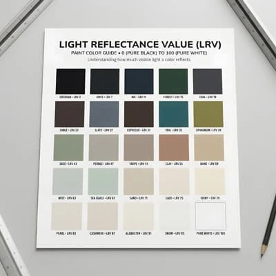
Only then do we open the fan deck. Numbers help, too. Every paint color has a light reflectance value on a scale from 0 to 100.
Sherwin-Williams’ Fun Yellow scores 78 and its Fiery Brown scores 5, so a pale yellow can reflect almost as much light as white, while a deep brown behaves much like black.
This guide walks through the process I use on real projects. You will see how orientation changes daylight, how to read LRV, how bulbs reshape paint colors after dark, and how to match mood to each room. You will also get a simple testing routine that prevents expensive repainting.
Why Light Decides Every Paint Color
A can of paint holds pigment, not a finished color. Pigment absorbs some wavelengths and reflects others, and your eye reads only what bounces back. Change the light and you change the color you see.
I organize every color decision around three pillars: light, orientation, and mood. Light is the raw material. Orientation tells you what kind of light the room receives. Mood is what you want that light to feel like once the paint is on the wall. Skip one pillar and the other two cannot rescue the result.
Architects treat light as a building material. ArchDaily’s project library, which you can filter by color, rests on the idea that color is central to how we perceive space. It can evoke warmth, tranquility, coolness, or excitement. That perception never stays still, because the light never stays still.
Charlotte Cosby, head of creative at Farrow & Ball, makes the same point. She says one color can look quite different from room to room, across the day, and even between seasons. The first thing she weighs is how much natural light a room gets and which way its windows face.
Why the Swatch Lies
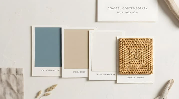
A swatch is small, flat, and surrounded by white card. A wall is large, lit from several angles, and surrounded by reflected color. The green lawn outside adds a green cast. An oak floor adds orange. A blue sky through the window adds a cooler note.
Why does paint look different on the wall than on the swatch? Paint looks different on the wall because the wall is larger, lit from several directions, and surrounded by reflected color. A swatch is small, flat, and framed by white.
That is why a color you loved in the store can feel wrong at home. The paint did not change. The conditions did.
Orientation: How Your Windows Shape Paint Colors
Orientation is the second pillar, and it is the fastest way to predict how paint colors will behave. Windows facing different directions collect different light. The table below describes the Northern Hemisphere. If you live south of the equator, read the tip box that follows.
| Window direction | Light quality | How colors tend to shift | Smart paint color strategy |
|---|---|---|---|
| North | Steady, indirect, cooler, least light overall | Cooler, grayer, sometimes harsher | Higher-LRV warm neutrals, or deep saturated colors that embrace the mood |
| South | Strong, warm, most light | Yellower and warmer | Cool or gray-leaning neutrals to balance, or red-based neutrals to amplify the glow |
| East | Bright, warm morning; cooler afternoon | Warm early, cooler later | Choose for the hours you use the room |
| West | Subdued, cooler morning; warm, golden evening | Cool early, warm late | Warm colors if used in the morning; cool colors can calm the evening glow |
North-Facing Rooms
Sherwin-Williams notes that north-facing rooms receive the least light through the day and often feel cool. Its guidance for these rooms is to look at colors with a higher LRV. Cosby adds that colors tend to look cooler and harsher in north light, which makes lightness hard to achieve.
You have two honest options. You can brighten the room with warm, light neutrals. Or you can stop fighting the light and go deep. Saturated colors read darker in north light, which creates a cocooning effect that suits a bedroom, a study, or an intimate dining room.
What are the best paint colors for a north-facing room? Warm-toned neutrals with a higher LRV brighten a north-facing room. Deep, saturated shades also work, because they turn the cool, low light into a cozy, enclosed mood.
South-Facing Rooms
South-facing rooms enjoy strong light for most of the day, so you have more freedom. That light is warm, and it pulls colors toward yellow. Sherwin-Williams points out that in south light, neutral-toned colors may seem warmer while cool-toned colors may seem more neutral.
You can balance that warmth with gray-leaning or green-leaning neutrals. You can also lean into it. Cosby suggests red-based neutrals to maximize warm light in a south-facing room. Both approaches work. Your choice depends on whether you want calm or glow.
East and West-Facing Rooms
These rooms change character across the day, so time of use matters more than direction alone. An east-facing kitchen glows at breakfast and cools by mid-afternoon. A west-facing living room feels dim in the morning and golden at dusk.
My rule of thumb is simple. If you use the room mostly before noon, treat an east room like a south room and a west room like a north room. If you use it mostly in the evening, reverse that.
Architect’s tip for the Southern Hemisphere: In Brazil, Australia, New Zealand, South Africa, and anywhere south of the equator, the sun sits in the northern sky. The north and south advice swaps, while the east and west advice stays the same. Find your window direction with a compass app, standing inside and facing out.
When Orientation Is Not the Whole Story
Trees, neighboring buildings, deep verandahs, and roof overhangs all filter light. A south-facing room under a wide eave can behave like a north-facing one. Judge the light you actually receive, not the light the compass suggests.
Light Reflectance Value: The Number Behind Smart Paint Colors
Architects check LRV before they check names. It tells you how bright a color will feel before you ever paint a sample.
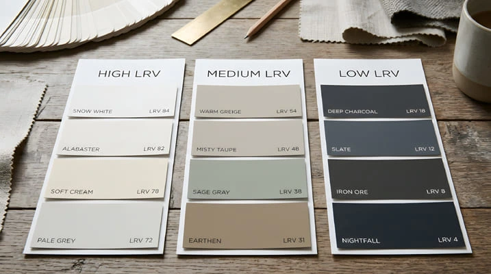
What is LRV? Light reflectance value (LRV) is a number from 0 to 100 that shows how much visible light a paint color reflects. A score of 0 would absorb all light and 100 would reflect all of it. Real paints always fall between the two.
LRV is a property of the color itself. The room’s light is a separate variable. A paint color with an LRV of 70 can only reflect the light it receives. In a dim room, even a high-LRV color has little to work with.
A Practical LRV Guide
The bands below are a rule of thumb, not an industry standard. Brands group colors differently, so use the ranges as a starting point.
| LRV range | Typical appearance | Best suited to |
|---|---|---|
| 0–20 | Deep and dramatic | Bright rooms, large spaces, intentional moody rooms |
| 20–40 | Rich mid-dark | Rooms with good daylight, dining rooms, libraries |
| 40–60 | Mid-tone | Balanced light, most living spaces |
| 60–80 | Light | Hallways, north-facing rooms, spaces with limited daylight |
| 80–100 | Very light | Ceilings, trim, very dim rooms |
Picture a 12 m² (about 130 sq ft) north-facing bedroom with one window. In an LRV 70 color, daylight bounces around and the walls feel airy. In an LRV 15 color, the same room feels enclosed by day and needs more lamplight. Neither choice is wrong. They deliver different moods, which is the third pillar at work.
Where to Find the LRV
You rarely need to hunt. LRV usually appears on the back of the color chip, and major brands list it on their websites for each color. If a color has no published LRV, ask the store to check.
A reflective wall also helps your lighting. More reflective paint can reduce how many fixtures a room needs and improve how evenly light spreads. Sorting your shortlist by LRV before you sort it by hue is one of the most useful habits you can build.
What LRV Does Not Tell You
LRV measures lightness, not saturation, and it says nothing about undertone. A warm putty at LRV 65 and a cool dove gray at LRV 65 reflect the same amount of light. They will still feel very different against the same floor.
Treat LRV as one filter. It narrows the field. Undertone, sheen, and surrounding materials do the rest.
Artificial Light: Why Paint Colors Change After Sunset
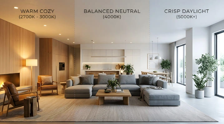
Daylight is only half the day. Your paint colors spend every evening under bulbs, and bulbs have their own color.
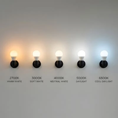
Bulb color is measured in Kelvin. Lower numbers look warmer, and higher numbers look cooler:
- 2700K: warm white, similar to an old incandescent bulb
- 3000K: soft white, a common choice for living spaces
- 4000K: neutral white, often used in kitchens and offices
- 5000K and above: cool daylight tones, which can feel clinical at home
Check the Color Rendering Index (CRI) too. A CRI of 90 or higher shows colors more faithfully, so your carefully chosen paint color does not turn muddy at night.
Home Decor:The Complete Guide to Interior Design, Lighting, Color, and Personal Style for Every Rooma-type=”link” data-id=”https://www.sherwin-williams.com/” rel=”noreferrer noopener”>Sherwin-Williams gives a handy shortcut for rooms with little daylight. Choose by your bulb temperature.
With warm bulbs, pick colors as you would for a south-facing room. With white or cool bulbs, pick as you would for a north-facing room.
Architect’s tip: Fit the bulbs you plan to use before you judge any samples. Then check your paint colors again after dark. A color that looks perfect at noon can turn orange, pink, or flat gray at 8 p.m.
Choosing Paint Colors by Mood and Room Function
Mood is the third pillar, and it is where personal taste enters. Color associations vary by culture and by person, so treat the table below as tendencies, not rules.
| Color family | Common mood | Works well in | Watch for |
|---|---|---|---|
| Warm neutrals (cream, putty, warm greige) | Welcoming, calm | Living rooms, bedrooms, north-facing rooms | Can turn yellow in strong south light |
| Cool grays and blue-grays | Crisp, airy, restrained | South-facing rooms, studios, bathrooms | Can feel cold in north light or under cool bulbs |
| Soft greens (sage, olive) | Restful, grounded | Bedrooms, home offices, rooms with garden views | Undertone swings between yellow-green and blue-green |
| Deep blues and teals | Enveloping, focused | Dining rooms, studies, evening rooms | Need layered lighting to avoid heaviness |
| Terracotta, clay, blush | Warm, sociable | Dining rooms, entries, north-facing living rooms | Can look orange or pink under warm bulbs |
| Soft whites | Open, clean | Ceilings, trim, galleries | Undertone clashes with warm or cool floors |
Match the Mood to the Hours You Use the Room
Think about when and how you live in each space.
Bedrooms reward lower contrast and softer depth. Muted greens, warm neutrals, and deeper blues support rest. Living rooms carry the widest range of activity, so they suit balanced mid-tones that adapt to changing light. Kitchens need honest color. You prepare food there, so a neutral, high-CRI setup helps you judge what you cook. Home offices work best with colors that feel steady rather than stimulating, such as soft greens or muted blue-grays.
Read the Undertone Before You Commit
Every neutral leans somewhere: yellow, pink, green, or blue. That lean is the undertone, and it decides whether a color feels warm or cool next to your floor.
Start with what you cannot change. Floors, countertops, and trim already set the baseline. Hold your chips next to them in daylight. A beige that looks neutral on its own can look pink beside gray stone.
Think About Sheen
Sheen changes how light behaves on the surface. Matt finishes absorb light and soften glare. Glossier finishes reflect more of it. A soft sheen such as eggshell or satin can brighten a dim room, while matt can calm a very bright one. Higher sheens also show wall imperfections, so match finish to wall condition.
Plan for Flow Between Rooms
Open plans and long corridors put several paint colors in view at once. I keep adjacent rooms within a shared undertone family. The colors can differ in depth, but they should agree on warmth. That simple rule makes a home feel designed rather than assembled.
How to Test Paint Colors Like an Architect
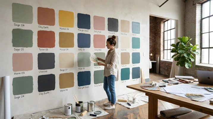
This is the routine I use. It takes about a week, and it costs far less than repainting.
- Define the room’s light. Note the window direction, the hours you use the room, and your bulb type.
- Shortlist three colors. Use LRV to match the room’s brightness, then choose undertones that suit your floor.
- Paint large boards. Use primed board or poster card, at least 60 × 60 cm (2 × 2 ft), with two coats. Leave a white border so your eye has a reference.
- Move the boards around. Place them on each wall, near the window, and in a corner. Light varies a lot within one room.
- Check four times a day. Look in the morning, at midday, in the late afternoon, and in the evening under your real bulbs.
- Compare against fixed elements. Hold the boards next to floors, counters, fabrics, and trim.
- Live with them for three days. Choose the one you still like after the novelty fades.
Architect’s tip: Paint boards, not the wall. Existing wall color contaminates your read, and you avoid creating patchy spots you will have to cover later.
Common Mistakes When Choosing Paint Colors
Most problems with paint colors come from a short list of repeated errors.
- Judging from a chip or a screen. Screens vary, and chips are too small. Always test a large sample in the room.
- Skipping the evening test. Daylight is only part of the story. Your color lives under bulbs half the time.
- Copying a photo from a different orientation. A pale gray that glows in a south-facing showroom can look dull in your north-facing bedroom.
- Assuming dark rooms need white paint. A north-facing room will not become bright and sunny with white paint alone. Warm, deep color can make it feel intentional rather than dim.
- Ignoring undertones in fixed finishes. Tile, stone, and wood set the temperature. Paint has to cooperate with them.
- Choosing trim last. Trim shapes the final impression. Test your wall and trim colors side by side.
Choosing Paint Colors With Confidence
Choosing paint colors like an architect means working in order. Read the light first. Identify the orientation next. Then let mood guide the final pick. Use LRV to predict brightness, check your bulbs after dark, and test large samples before you commit.
You do not need a trained eye to do this. You need a repeatable process and a little patience. The reward is a room that looks the way you imagined, in the morning and at night.
Try the testing routin Home Decor:The Complete Guide to Interior Design, Lighting, Color, and Personal Style for Every Room on one room this week, and tell me in the comments how your samples behaved. For more guides on light, color, and design, explore the rest of the Home Decor category.

Architect with extensive experience in residential and commercial design, including renovations and modular construction. Love to share information about Architecture, home and lifestyle in this blog.