Last updated on September 14th, 2026 at 05:22 pm
Why Home Decor Is a Design Discipline, Not Just Decoration
What “home decor” actually means as a system
When a new client first invites me into their home to talk about a decorating project, the conversation almost always starts with individual pieces: a sofa they’ve been eyeing, a color they saw somewhere, a lighting fixture that caught their eye in a magazine. It’s a natural place to start, but it’s also, almost without exception, the wrong one, in exactly the same way choosing a plant before understanding your garden’s site conditions is the wrong place to start a landscape project. Decor isn’t a shopping list. It’s a design system, and every individual piece — furniture, color, lighting, art — is only as effective as the underlying logic connecting it to everything else in the room.
I think of style, the word I’ve built this entire guide around, as something considerably more specific than a Pinterest aesthetic or a label like “modern” or “farmhouse.” Style, in the way I use the term with every client, is the consistent set of decisions a home makes about proportion, material, color, and light — decisions that, taken together, make a space feel intentional rather than assembled. A room with genuine style doesn’t necessarily cost more than one without it. It simply has a coherent internal logic: the lighting supports the color palette, the furniture scale matches the room’s proportions, and every object present earns its place rather than filling empty space by default.
This is really the same principle I’ve written about extensively in relation to architecture and garden design elsewhere on this site — that good design, at any scale, is a system rather than a collection of individually pleasing choices.
A home’s interior is no exception. A beautifully chosen sofa in a poorly lit room will never look as good as a modest sofa in a room where light, color, and proportion have all been considered together. Understanding decor as a system, rather than a series of independent purchases, is the single most useful mental shift I can offer any reader working through this guide, and it’s the thread that connects every section that follows.
How decor connects to architecture and interior flow
I come to interior decor from a background in residential and commercial architecture and project management, not from styling or merchandising first, and that background genuinely shapes how I think about every decor decision covered in this guide.
A room’s decor doesn’t exist independently of the architecture containing it — the same relationship between proportion, light, and material that defines a building’s exterior style extends inward, whether a homeowner consciously designs for that continuity or lets it happen by accident.
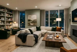
This connection shows up constantly in the projects I manage. A home with a Mid-Century Modern or Contemporary architectural style, built around horizontal lines, open plans, and a strong connection to the outdoors, calls for decor that reinforces that same openness: furniture with clean lines and lower profiles, a restrained color palette, and lighting that emphasizes horizontal planes rather than competing with them.
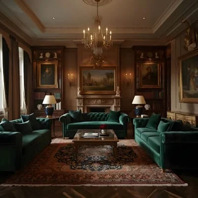
A Craftsman or Farmhouse home, built around natural materials and visible structure, calls for decor that honors that same honesty — natural wood tones, textured textiles, and a warmer, less polished material palette than a strictly Contemporary interior would use.
A home with a traditional, symmetrical Colonial or Georgian façade often benefits from decor that echoes that same balance internally, even if individual rooms are furnished more informally than the exterior’s formality might suggest.
I raise this architectural connection early in this guide for the same reason I raised it in my architecture and garden design guides: it’s the single most reliable design cue available, and it’s the one most decor content online completely ignores. Most decorating advice treats a room as a blank box, disconnected from the structure around it, and offers generic styling formulas that could apply to literally any home. But a room’s proportions, its window placement, its ceiling height, and its relationship to the rooms around it are already telling you a great deal about what decor decisions will genuinely work, if you take the time to actually read them before reaching for a paint chart or a furniture catalog.
The three pillars: light, color, and personal meaning
I’ve organized this entire guide around three pillars, because in my experience, nearly every decor decision — no matter how small it initially seems — ultimately traces back to one of them, and understanding which pillar a given decision belongs to helps clarify what kind of expertise or consideration it actually requires.
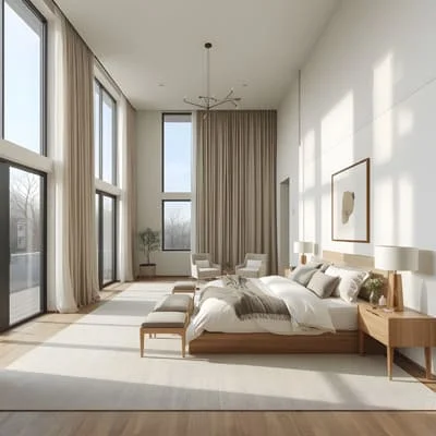
Light is the pillar I address first in nearly every project, and it’s also the one most frequently underestimated by homeowners working through a decorating project on their own.
How natural and artificial light interact with a room determines how every other decision in that space will actually read — the same paint color can look completely different under morning light from an east-facing window versus the warm glow of evening lamp light, and no amount of careful furniture selection compensates for a lighting plan that hasn’t been genuinely considered.
Color is the second pillar, and it’s the one most people instinctively gravitate toward first, since it’s the most immediately visible and emotionally evocative decision in any room. But color, as I’ll cover in real depth in the section ahead, doesn’t function in isolation — it interacts directly with the light pillar, and a color chosen without accounting for a room’s specific light conditions rarely performs the way it did on the paint swatch or the show-home photograph that inspired it.
Personal meaning is the third pillar, and it’s the one I think gets least acknowledged in most decorating content, despite being what actually separates a genuinely successful home from one that simply follows a trend competently.
A home decorated purely to match a current aesthetic, without any object or choice that reflects the actual people living in it, tends to feel curiously impersonal regardless of how technically well-executed the light and color decisions are. The best decor projects I’ve been involved in always find room for this third pillar — objects, art, and small personal choices that make a space unmistakably belong to the people who live there, rather than reading as an interchangeable showroom.
What this guide covers
I’ve structured this guide the way I’d actually walk a client through a decorating project from the very first conversation through to long-term evolution of a finished space, because I think that sequence matters considerably more than most decor content acknowledges. We’ll start with how to genuinely read a room before decorating it at all — its light, its proportions, and the architectural cues it’s already offering — because I think skipping this step is the most common and costly mistake in home decor, in exactly the same way skipping site analysis is the most common mistake in garden design.
From there, I’ll go deep into color psychology and building a whole-home palette strategy, followed by a full section on lighting design, since I consider these two pillars to be the foundation everything else in a room is built on top of. After that, I’ll move into the more expressive layers of decor: wall design and art, the philosophy and practice of minimalism and personal object curation, and the often-overlooked role interior doors and thresholds play in how a home actually flows from room to room.
I’ve also dedicated sections to designing rooms for specific life stages and functions — nurseries, home offices, bedrooms, and flexible multipurpose spaces — since I think generic, room-agnostic decor advice fails precisely at the moments it matters most. I’ll cover the materials and textures that genuinely define interior style, practical organization and functional decor, and a full section on budgeting sensibly across affordable, DIY, and luxury price points, since I know most readers of this guide are planning a real project on a real budget rather than an unlimited one.
Finally, I’ll bring everything together into a practical framework for choosing — and evolving — your own personal style over time, along with the mistakes I see most often when a decorating project loses its way partway through. My goal, as it is in every guide I write, is to make the technical side of this accessible enough that you can make confident, informed decisions in your own home, rather than simply following whatever happens to be trending this season.
Reading a Room Before You Decorate It
Natural light, orientation, and how a room actually behaves
I opened this guide by naming light as the first of the three pillars, and I want to make good on that immediately, because I genuinely believe more decorating disappointment traces back to misunderstanding a room’s light than to any other single factor. Before I let a client choose a single paint color or piece of furniture, I ask them to spend real time simply observing how light moves through the room across a full day, in the same deliberate, observational way I’d recommend approaching a garden site before planting a single seed.
A room’s orientation — which direction its windows face — tells you a great deal about its baseline light character before you’ve even stepped inside. North-facing rooms, in the northern hemisphere, tend to receive cooler, more consistent, less directly intense light throughout the day, which affects how warm colors read within them and how much they benefit from supplemental warm artificial lighting.
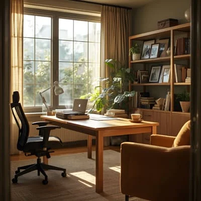
South-facing rooms typically receive the most direct, intense sunlight, often shifting dramatically in character between morning and afternoon, and can support cooler color choices that would otherwise feel flat or cold in a room without that natural warmth and intensity.
East- and west-facing rooms each get a strong directional light at one end of the day and comparatively little at the other, which matters enormously for rooms with a specific daily-use pattern — a home office used primarily in the morning benefits from being read specifically under morning light conditions, not simply assessed at whatever time of day a decorating decision happens to be made.
I’d encourage every reader to actually observe their own rooms at a few different times of day before committing to major decor decisions, rather than assuming a general orientation rule tells the whole story, since window size, nearby obstructions like trees or neighboring buildings, and even wall color already in place all modify how a room’s theoretical orientation actually plays out in practice. This is genuinely the same discipline I recommend at the start of any garden design project, applied indoors: understanding your specific conditions before designing around an assumption of what those conditions probably are.
Room proportions, ceiling height, and sightlines
Once light is understood, the next layer of reading a room is its physical proportions — the relationship between floor area, ceiling height, and window placement — because these dimensions set real boundaries on what decor decisions will genuinely succeed, in much the same way a garden’s scale needs to relate proportionally to the house it surrounds.
Ceiling height in particular shapes a huge share of subsequent decor decisions, often more than homeowners initially realize. A room with generous ceiling height can support taller furniture, dramatic lighting fixtures, and bolder pattern scale without feeling oppressive, while the same choices in a lower-ceilinged room can make the space feel cramped and visually heavy rather than elegant. Conversely, a lower-ceilinged room often benefits from decor choices that visually stretch the space upward — vertical elements, lighter color values on the ceiling itself, and furniture kept appropriately lower in profile — rather than choices that emphasize horizontal mass and inadvertently draw attention to a ceiling that already feels close.
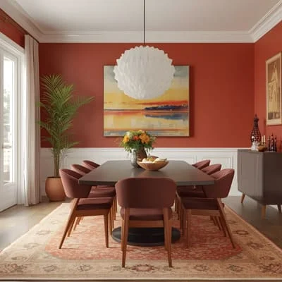
Sightlines matter just as much indoors as I’ve described them mattering in garden layout, and I always encourage clients to think about what’s actually visible from a room’s primary entry point and its main seating positions before finalizing any layout.
A striking piece of art or a considered furniture arrangement, positioned somewhere it’s rarely actually seen from the positions people genuinely occupy, is effort spent in the wrong place, while a genuinely unremarkable utility element — a visible cable box, an awkward radiator, a poorly placed door — sitting directly within a primary sightline is a problem worth solving deliberately, whether through relocation, screening, or simply reframing the layout around it.
How architecture (doors, windows, flow) shapes decor choices
The architectural bones of a room — where its doors and windows sit, how it connects to adjacent spaces, and what its structural fixed points genuinely are — set constraints that good decor works with rather than against, and I think respecting these constraints is what separates decor that feels considered from decor that feels imposed onto a space regardless of what that space actually offers.
Door and window placement dictates a huge amount of a room’s usable wall space and traffic flow before a single decor decision gets made. A wall interrupted by two doorways and a window genuinely has very little usable space for a large piece of furniture or significant art, and I’d rather see a client accept that constraint and design around it — perhaps treating that limited space as a considered vignette rather than fighting it with an oversized piece that will always feel crowded. Similarly, the natural traffic path through a room, dictated by where its doors actually connect to adjacent spaces, should generally stay clear rather than being obstructed by furniture placement that looks good in isolation but disrupts how people actually move through the home day to day.
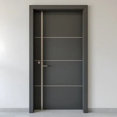
I’ll return to the specific role of interior doors in far more depth later in this guide, since I think they deserve dedicated treatment as a decor and architectural element in their own right, but the principle worth establishing here is broader: a room’s fixed architectural features are not obstacles to be minimized or disguised, but genuine design information, telling you where furniture naturally belongs, where a room’s true focal wall actually is, and how that room relates to the flow of the home around it.
Auditing a room honestly before buying anything
I want to close this section with a practical exercise I walk through with every client before any purchasing decision gets made, because I think it’s the single most useful habit a reader of this guide can develop from this entire section. Before buying anything, audit the room honestly: note its true orientation and light pattern across a full day, its actual proportions and ceiling height, its fixed architectural features and genuine traffic flow, and — just as importantly — an honest account of how the room is actually used day to day, rather than how you imagine it might ideally be used.
This audit consistently reveals gaps between a client’s initial decorating instinct and what a room can actually support well. A dramatic, oversized statement light fixture, ordered because it looked wonderful in a much larger showroom space, often turns out to be genuinely disproportionate to a lower-ceilinged room once properly measured against the space’s real dimensions.
A cool, gallery-white color scheme, chosen from an inspiration photograph shot in a bright, south-facing room, can read as flat and lifeless in a client’s own north-facing space with genuinely different light conditions. Catching these mismatches during an honest room audit, before money has been spent, is consistently the difference between a decorating project that feels effortless once finished and one that requires expensive correction after the fact — which is really the same principle I’ve emphasized throughout my architecture and garden guides, simply applied at the scale of a single room: understand your actual site before you design for it.
The Psychology of Color in Home Decor
How color affects mood, energy, and perceived space
Color is the decor decision most people make first, and I think that instinct is understandable, since color is genuinely one of the most emotionally immediate elements in any room — but I always encourage clients to treat color as a decision made in response to the light and proportion audit covered in the previous section, rather than as the starting point of a project in its own right. Understanding how color actually functions psychologically and spatially makes that sequencing considerably easier to justify, so it’s worth covering the mechanics before the strategy.
Color has a well-documented, genuine effect on mood and perceived energy in a space, and I’ve seen this play out consistently across very different projects.
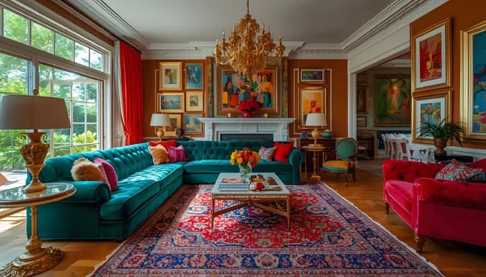
Warmer hues — reds, oranges, warm yellows — tend to feel energizing and sociable, which is part of why they work so well in dining rooms and spaces meant for gathering and conversation, but the same warmth can feel overstimulating in a room meant primarily for rest. Cooler hues — blues, greens, cooler grays — tend to feel calming and restful, which makes them consistently popular choices for bedrooms and spaces meant to support relaxation, though taken too far without any warmth to balance them, a cool palette can start to feel sterile or emotionally distant rather than genuinely soothing.
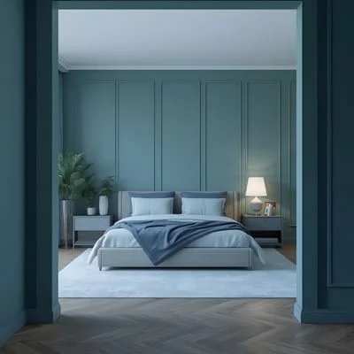
Color also has a real, measurable effect on how spacious or intimate a room feels, independent of its mood associations. Lighter, cooler colors tend to recede visually, making a room feel more expansive and open, which is why they’re so often recommended for smaller spaces — though I’d add the caveat that a small room painted entirely in pale, characterless neutrals can end up feeling less like an intentionally airy space and more like an underdeveloped one, missing the personal-meaning pillar I introduced earlier in this guide.
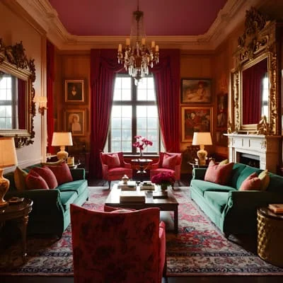
Darker, more saturated colors tend to advance visually, making a room feel more enclosed and intimate — a quality that can work beautifully in a room meant to feel cozy and cocoon-like, such as a den or a formal dining room used primarily in the evening, but that can feel oppressive in a room that genuinely needs to feel open and functional throughout the day.
Warm vs. cool palettes and when to use each
Building on that foundation, I want to be specific about how I actually help clients decide between warm and cool palettes for a given room, since I think most color advice stops at describing the emotional associations without offering a genuinely practical decision framework. My starting point is almost always the room’s function, established honestly during the audit I described in the previous section, cross-referenced against its natural light conditions.
A room used primarily for high-energy social activity — a kitchen, a dining room, an entertaining space — tends to support a warmer palette well, especially if that room also receives strong natural light for much of the day, since warm tones under strong natural light read as vibrant and inviting rather than overwhelming.
A room used primarily for rest or focus — a bedroom, a reading nook, a home office needing genuine concentration — tends to support a cooler or more muted, desaturated palette, particularly useful in a room that already receives strong, potentially overstimulating natural light, where a cooler palette helps balance and calm that intensity rather than compounding it.
Light conditions themselves should genuinely influence which end of the warm-cool spectrum a room can support, independent of its function.
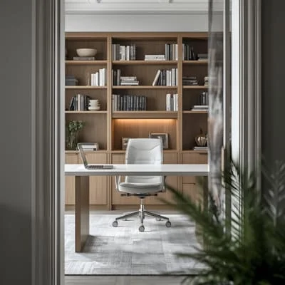
A north-facing room with naturally cool, consistent light often needs a color choice with some inherent warmth to avoid feeling cold and flat, even if the room’s function might otherwise suggest a cool palette — a warm, slightly muted version of a cool hue rather than its coolest, most saturated equivalent. A south- or west-facing room with strong, warm natural light can support genuinely cool color choices without the room feeling sterile, since the room’s own light is already supplying the warmth a color choice alone would otherwise need to provide.
Building a whole-home color strategy
Individual room color decisions, made in isolation, frequently produce a home that feels visually disconnected from room to room, which is why I always encourage clients to think about color at the scale of the whole home before finalizing any single room’s palette — a principle directly analogous to the whole-property thinking I’ve emphasized throughout my architecture and garden guides.
The technique I use most consistently is establishing a limited, coherent palette of two to four core colors intended to recur, in different proportions and applications, throughout the connected spaces of a home, rather than treating each room as a completely independent color decision.
This doesn’t mean every room needs to be the same color — it means the colors chosen across different rooms should genuinely relate to each other, sharing an underlying warmth, saturation level, or undertone, so that moving from room to room feels like a considered variation on a theme rather than an abrupt, unrelated shift.
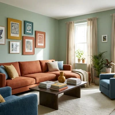
Sightlines between connected rooms, a principle I introduced in the previous section, matter enormously here as well. Two rooms visible from the same vantage point — a living room and an adjoining dining area, for instance, or a hallway with sightlines into several bedrooms — need genuinely more careful color coordination than two rooms that are never seen simultaneously, since a jarring color transition is far more noticeable when both colors are visible in the same glance than when a closed door genuinely separates two spaces experienced one at a time.I generally treat these highly visible transition points as the places where a whole-home color strategy earns its keep most directly, prioritizing coordination there even if a more private, enclosed room elsewhere in the home has more freedom to diverge from the broader palette.
Common color mistakes and how to avoid them
I want to close this section with the color mistakes I see most consistently across projects, since nearly every one traces back to skipping a step covered earlier in this section rather than reflecting a fundamentally poor color instinct to begin with. The single most common mistake is choosing color from a small paint swatch or a digital screen without testing it at real scale under the room’s actual light conditions — a color that looks perfectly balanced on a two-inch chip can shift dramatically once applied across an entire wall and viewed under the specific, sometimes unflattering light conditions established during the room audit I described earlier. I always recommend testing a genuinely large sample — painted directly on the wall or on a large board that can be moved around the room — and observing it across a full day before committing.
The second common mistake is choosing color in isolation from the rest of the home, producing the disconnected, room-by-room patchwork I described in the previous section. The third, and one I think is genuinely underappreciated, is treating color purely as a wall-paint decision while ignoring the color already present in flooring, existing furniture, and fixed architectural materials that aren’t easily changed — a beautifully chosen wall color can still clash badly with an existing wood floor tone or a fixed stone fireplace surround if those materials weren’t genuinely accounted for during the color-selection process.
Reading a room’s full existing material and color palette, not just its blank walls, before choosing a new color is a discipline that consistently separates a genuinely successful color scheme from one that looks right in isolation but wrong once actually installed in its real context.
Lighting Design for a Cozy and Functional Home
Layering light: ambient, task, and accent
I introduced light as the first of this guide’s three pillars, and I want to return to it now with the same technical depth I applied to color, because I think lighting is consistently the most under-designed element in residential decor, despite affecting how every other decision in a room actually reads. The foundational principle I use on every project is layering light into three distinct functional categories, rather than relying on a single central fixture to do all of a room’s lighting work — a mistake I see in an enormous share of the homes I’m asked to help improve.
Ambient light is the general, overall illumination that fills a room and allows basic function and movement — historically provided by a central ceiling fixture, though increasingly, in my own practice, distributed across several sources rather than concentrated in one, which produces a more even, flattering overall light quality and avoids the harsh, flat effect of a single overhead source.
Task light is the focused, functional illumination needed for a specific activity — reading, cooking preparation, working at a desk — and it needs to be bright and well-positioned enough to genuinely support that task without relying on the room’s general ambient light to compensate, which it rarely does adequately on its own. Accent light is the layer most decorating projects skip entirely, and it’s the one that does the most work toward the “cozy” quality most clients specifically ask for — light directed at art, textured walls, or architectural features, creating depth and visual interest rather than the flat, uniform illumination that ambient light alone tends to produce across an entire room.
A room lit exclusively by a single central ambient fixture, however bright, will almost always feel less considered and less comfortable than the same room lit through a genuine combination of all three layers, even at a lower total light output. I think of this the same way I described plant layering in garden design earlier in my work on this site — canopy, mid-story, and groundcover each performing a distinct function that, together, create a considerably richer result than any single layer could achieve alone.
Natural light vs. artificial light strategies
Natural and artificial light need to be planned together, not as separate, sequential concerns, since a room’s artificial lighting plan should genuinely respond to how that room’s natural light behaves across the day, established during the audit I described earlier in this guide. A room with strong, consistent natural light for much of the day needs a fundamentally different artificial lighting strategy than a room with limited natural light or one whose natural light pattern is heavily skewed toward a single part of the day.
For rooms with limited or inconsistent natural light, I generally recommend a more robust ambient layer, since artificial light is doing more of the room’s overall illumination work throughout the day rather than simply supplementing already-adequate daylight. Color temperature matters considerably here as well — a warmer artificial light temperature tends to compensate well for a room lacking natural warmth, particularly in the cooler-lit, north-facing conditions I described earlier, while a cooler artificial temperature can feel genuinely harsh and clinical in a room already lacking natural warmth, compounding rather than balancing the room’s existing character.
For rooms with strong, direct natural light, the artificial lighting plan needs to hold its own convincingly once that natural light fades in the evening, which is where the ambient-task-accent layering discussed above becomes particularly important — a room that relies heavily on daytime natural light and has under-invested in its artificial lighting plan often feels like a genuinely different, less considered space after dark than it does during the day, which undermines the sense of coherent style this entire guide has been building toward.
Smart lighting and automation
Smart lighting has moved, in the projects I manage now, from a novelty feature to a genuinely practical tool for executing the layered lighting strategy described above with far more precision and flexibility than traditional fixed switching allows. The most immediate practical benefit is the ability to adjust a room’s lighting layers independently and situationally — dimming the ambient layer for an evening gathering while keeping a task light bright over a specific work surface, or shifting color temperature warmer in the evening to support a calmer, more restful mood as a household winds down for the night.
Automated and scheduled lighting also solves a genuinely practical problem I see in a lot of homes: lighting that technically supports every function a room needs but requires manually adjusting several separate switches and dimmers to actually access any single one of those configured states, which in practice means most households default to whatever single lighting setup is easiest to activate, regardless of whether it’s actually the right one for what’s happening in the room at that moment.
A well-programmed smart system allows a household to access a genuinely considered lighting layer combination — an evening reading mode, a morning task-focused mode, an entertaining mode — through a single, effortless action, which meaningfully increases the odds that a well-designed lighting plan actually gets used as intended rather than abandoned in favor of whatever’s most convenient.
I’d add one caution here that I think is worth taking seriously: smart lighting technology should support a room’s decor and architectural style, not visually compete with it, in the same way I discussed home automation integrating invisibly into residential architecture in my writing elsewhere on this site. The best-executed smart lighting installations I’ve been involved in are ones a visitor genuinely doesn’t notice as “technology” at all — they simply notice that the room’s light feels remarkably well suited to whatever’s happening in it at that particular moment.
Lighting mistakes that undermine good decor
I want to close this section with the lighting mistakes I see most consistently, because — much like the color mistakes covered in the previous section — they tend to undermine decor decisions that are otherwise genuinely well made elsewhere in a room. The most common mistake is relying on a single central ambient fixture as a room’s entire lighting plan, producing the flat, uniform, uncozy quality I described earlier regardless of how carefully every other decor element in the room has been chosen.
The second common mistake is choosing fixtures purely for their appearance without genuinely accounting for the quality, direction, and color temperature of light they actually produce — a beautiful fixture that casts harsh, poorly directed light, or an attractive bulb choice with a color temperature that clashes badly with a room’s color palette, undermines far more of a room’s overall feel than most homeowners initially expect from what seems like a minor technical detail. The third, and one I’d specifically flag given how much attention this guide has already given to accent lighting, is skipping the accent layer entirely and treating lighting purely as a functional necessity rather than a genuine decor tool in its own right — a room with excellent art, texture, and color, lit only by flat ambient light with no accent layer drawing attention to any of it, fails to actually showcase the very decor decisions that room’s owner presumably invested real thought and money into achieving.
Wall Design, Art, and Personal Expression
Wall finishes, texture, and wallpaper trends
Walls are the largest continuous surface in almost any room, and I think they deserve more deliberate design attention than the single flat coat of paint most decorating projects default to without much further consideration. Texture, in particular, is a layer I find gets significantly underused relative to how much visual and tactile richness it can add to a space, especially in rooms where the color and lighting decisions covered in the previous two sections are already well handled but the space still reads as somehow flat or unfinished.
Textured finishes — limewash, plaster, textured paint techniques — introduce genuine depth and variation in how light plays across a wall surface throughout the day, in a way flat paint simply can’t replicate, and they tend to suit the same natural-material, honest-construction philosophy I’ve written about in relation to Craftsman and Farmhouse architectural style elsewhere on this site.
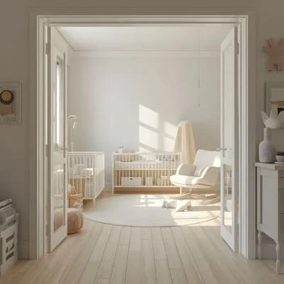
Wallpaper, which has moved through several cycles of popularity and rejection over the decades, is currently experiencing a genuine resurgence, and I think that’s because contemporary wallpaper products have improved substantially in both durability and design sophistication, offering pattern, texture, and visual interest that would be genuinely difficult to achieve through paint alone.
The design principle I apply consistently, regardless of which specific finish a client chooses, is restraint in application: a heavily textured or patterned wall finish tends to work best applied to a single feature wall or a clearly bounded space, rather than uniformly across every surface in a room, since the same principle of visual weight I discussed earlier in relation to Minimalist design applies here directly — a bold wall treatment carries more impact, and creates a clearer focal point, when it isn’t competing with an equally bold treatment on every other surface in the same room.
Gallery walls and sculptural art
Art is where a home’s decor most directly connects to the personal-meaning pillar I introduced at the start of this guide, and I think gallery walls specifically deserve careful technical treatment, since a poorly executed gallery wall is one of the more common decor disappointments I encounter — an idea that looks effortlessly curated in inspiration photographs but often ends up feeling genuinely chaotic once actually installed without a considered underlying plan.
The technical foundation of a successful gallery wall is consistent spacing and a clear organizing principle, even when the individual pieces themselves vary considerably in size, frame style, or subject matter — a shared frame color across otherwise varied pieces, a consistent gap measurement between each piece, or a deliberate grid structure all provide the same kind of underlying coherence that a genuinely successful Victorian façade achieves through picturesque variety organized around a shared set of principles, rather than true randomness.
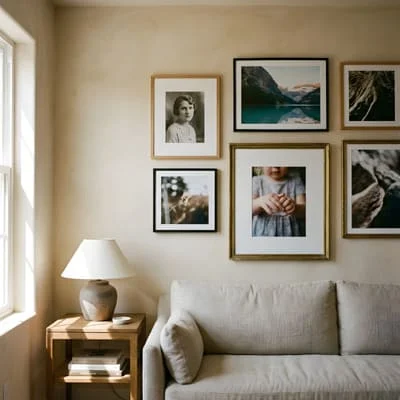
I always encourage clients to lay out a planned gallery wall on the floor first, or to trace paper templates directly onto the wall before hanging anything, since this catches proportion and spacing problems while they’re still easy and inexpensive to correct.
Sculptural art and three-dimensional objects introduce a different design consideration than flat wall art, since they interact directly with the lighting layers discussed in the previous section — a sculptural piece genuinely benefits from the accent lighting layer I described earlier, since directional light creates shadow and dimension that flat ambient illumination alone simply can’t produce. I generally encourage clients working with sculptural pieces to think about their placement in relation to a room’s natural sightlines, established during the room audit covered earlier in this guide, positioning a genuinely striking three-dimensional piece where it functions as a true focal point rather than being lost in a corner rarely actually looked toward.
Combining art and photography cohesively
Combining flat photography with more textured or sculptural wall art is a specific challenge I’m asked about often, since the two mediums have genuinely different visual qualities — photography tends to read as more precise, contained, and often more personal in subject matter, while sculptural and textured art tends to read as more expressive and tactile — and combining them without a considered strategy can produce a wall that feels visually inconsistent rather than intentionally varied.
The technique I use most consistently is establishing a shared element that ties the different mediums together, even when their individual character differs considerably: a consistent frame treatment across photography pieces displayed alongside unframed or differently mounted sculptural work, a shared color palette that runs across both the photographs’ subject matter and the surrounding art, or a deliberate curatorial theme — family history, a shared travel destination, a particular period of a household’s life — that gives a visitor a genuine reason for why these particular pieces belong together in this specific arrangement, rather than reading as an assortment gathered without any organizing logic.
I’d also encourage readers to resist the instinct to treat photography purely as documentation, hung without the same design consideration given to other art in the home.
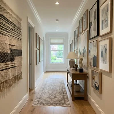
A personal photograph, printed and framed with the same care given to a piece of purchased art, and positioned with the same attention to sightlines, scale, and lighting covered throughout this section, carries the personal-meaning pillar I introduced at the start of this guide more directly than almost any other decor element available, and deserves to be treated with commensurate design seriousness rather than being relegated to a hallway as an afterthought.
Decorating with statement natural elements (florals and beyond)
Bold natural elements — a striking floral arrangement, a dramatic branch or botanical specimen, a large houseplant with genuine sculptural presence — function very similarly to the sculptural art discussed above, and I think they deserve the same deliberate placement and restraint applied to any other visually dominant decor element. A single, well-chosen statement floral or botanical piece, given genuine room to be seen clearly, reads as considerably more intentional and impactful than the same element crowded among too many other competing decorative choices in the same space.
The specific design challenge with a genuinely bold natural element — a large sunflower arrangement, for instance, or an oversized dramatic plant — is that its visual weight and seasonal or living variability need to be balanced against the rest of the room’s more static, permanent decor decisions.
I generally advise treating a bold natural statement piece the way I’d treat any other single focal point discussed throughout this section: positioned deliberately within a genuine sightline, given adequate surrounding negative space rather than crowded by competing objects, and considered in relation to the room’s color palette so the statement piece feels integrated into the broader scheme rather than visually disconnected from everything around it.
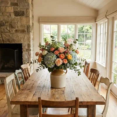
I’d also note that natural elements bring a genuinely different sensory quality to a room than any other decor category covered in this guide — texture, subtle fragrance, and a living, changing presence that static art and furniture simply can’t replicate, echoing the sensory design principles I’ve written about at length in relation to garden design elsewhere on this site. A home that incorporates this sensory layer deliberately, rather than treating natural elements as purely visual decoration, tends to feel more genuinely alive and considered than one relying purely on static, unchanging objects throughout every room.
Minimalism and the Meaning of Small Objects
What minimalist decor really means (and what it isn’t)
I want to be precise about minimalist decor here, because I think the term gets used loosely enough in popular decorating content that it’s often confused with simply owning fewer things, when the actual design philosophy is considerably more specific than that. Minimalist decor, in the sense I use the term with clients, is built around the same principle I’ve described in relation to Minimalist architecture elsewhere on this site: radical restraint that treats empty space, proportion, and a limited material palette as active design tools, rather than treating an empty room as simply an unfinished one waiting to be filled.
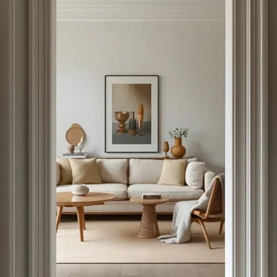
Executed well, minimalist decor is considerably more demanding than it might initially appear, for exactly the reason I’ve described in relation to Minimalist architecture: when you remove ornamentation and visual noise, every remaining object carries disproportionate visual weight, since there’s nothing else present to compete for attention or to disguise a poorly chosen or poorly positioned piece.
A single mismatched object in a genuinely minimalist room is far more visible, and far more disruptive to the room’s overall coherence, than the same mismatched object would be if lost within a denser, more eclectically furnished space.
What minimalist decor isn’t, and what I think the common misunderstanding actually amounts to, is an aesthetic built around deprivation or a cold, unlived-in feeling. A genuinely successful minimalist room still incorporates warmth, texture, and the personal-meaning pillar I’ve emphasized throughout this guide — it simply does so through a small number of carefully chosen elements rather than a large volume of them, which is a fundamentally different design discipline than simply removing personality from a space in pursuit of visual cleanliness alone.
Curating objects with emotional and personal significance
I think the most useful skill covered in this entire section is genuine curation — the discipline of choosing which small objects actually earn a place in a room, based on real personal or emotional significance, rather than simply displaying whatever decorative objects happen to be on hand. This is a discipline that matters regardless of whether a client is working toward a strictly minimalist aesthetic or a more maximalist, eclectic one, since even a densely decorated room benefits from every object present having a genuine reason to be there.
The practical exercise I walk through with clients is asking, honestly, what story or memory a given object actually carries, and whether that story is something the object’s owner would want a visitor to genuinely ask about. Objects with real personal history — a piece collected during meaningful travel, an item connected to family history, something handmade or gifted with genuine significance — tend to anchor a room with a kind of authenticity that purely decorative, purchased-for-the-look-alone objects simply can’t replicate, regardless of how aesthetically coordinated those purchased objects might be with the rest of the room.
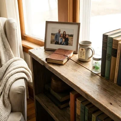
This curation discipline also serves a genuinely practical decluttering function, which I’ll return to later in this guide when discussing organization more broadly. A household that’s genuinely honest about which objects carry real personal or emotional weight, versus which simply accumulated over time without any particular significance, tends to find the process of editing down to a more considered, coherent collection of decor considerably less emotionally difficult than one that treats every possession as equally worth keeping and displaying by default.
Balancing restraint with warmth
The tension I’m asked to help resolve most often in minimalist-leaning projects is exactly the balance named in this section’s title: how to achieve genuine visual restraint without the room tipping into feeling cold, sterile, or uninviting — a genuinely common failure mode I see in minimalist decor attempted without sufficient attention to the warmth side of that balance.
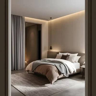
Texture is the tool I rely on most consistently to introduce warmth without compromising a restrained, minimalist material and object palette.
A room with very few objects and a limited color range can still feel genuinely warm and inviting if it incorporates varied, tactile textures — a substantial wool throw, natural wood grain left visible rather than painted over, a nubby linen upholstery — since texture provides sensory richness and visual interest without requiring additional objects or colors that would compromise the room’s underlying restraint.
Warm lighting, covered in real depth in the previous section, is the second tool I rely on heavily in minimalist spaces specifically, since a restrained room lit with cool, flat, purely functional light reads as considerably colder than the same room lit with the warm, layered lighting strategy described earlier in this guide. And finally, allowing genuine personal objects — chosen through the curation discipline described above, even if there are very few of them — to remain present rather than removed entirely in pursuit of an impersonally clean aesthetic, is what ultimately separates a minimalist room that feels genuinely warm and lived-in from one that simply feels empty.
Building a personal, uncluttered space that still feels lived-in
I want to close this section by bringing the object-curation and restraint-warmth balance together into a single practical principle: an uncluttered space and a personal, lived-in space aren’t in tension with each other, provided the objects present are chosen through genuine curation rather than either indiscriminate accumulation or indiscriminate removal.
The households I’ve worked with who’ve achieved this balance most successfully tend to apply a rotation principle rather than a purely static one — keeping a genuinely curated core of meaningful, well-placed objects on permanent display, while cycling other meaningful items in and out of storage over time, rather than attempting to display an entire collection simultaneously regardless of how that volume affects the room’s overall restraint and coherence. This rotation approach lets a household maintain both the personal-meaning pillar I’ve emphasized throughout this guide and the visual restraint that makes any individual object, once displayed, genuinely legible and appreciated rather than lost among too many others competing for the same attention.
Doors, Thresholds, and the Flow of a Home
How interior doors affect light and movement
Interior doors are, in my experience, one of the most overlooked architectural elements in residential decor, treated by most homeowners as purely functional hardware rather than as a genuine design decision with real consequences for how light and movement work through a home — a gap I think is worth closing early in this section, since it connects directly to both the light pillar and the room-flow principles established earlier in this guide.
A closed solid door blocks not just physical movement but light and sightlines between spaces, which matters enormously for rooms that depend on borrowed light from an adjacent, better-lit space — a windowless interior hallway or a small room with limited natural light of its own can genuinely benefit from a door style that allows some light transfer, whether through glazed panels, frosted glass, or simply a policy of keeping certain doors open by design rather than by habit. I always encourage clients to map which rooms in their home are genuinely light-poor and consider door choices specifically at those threshold points as part of the broader lighting strategy discussed earlier, rather than treating door selection purely as a hardware and finish decision disconnected from a home’s overall light plan.
Door placement and swing direction also shape movement through a home in ways that affect furniture placement and room usability considerably more than most homeowners account for during a decorating project.
A door that swings into a room’s primary furniture zone constrains layout options in that space permanently, regardless of how the rest of the room is decorated, and I’ve seen genuinely well-executed decor projects undermined by a furniture arrangement forced into an awkward compromise simply because a door’s swing path was never properly accounted for during the room’s original layout planning.
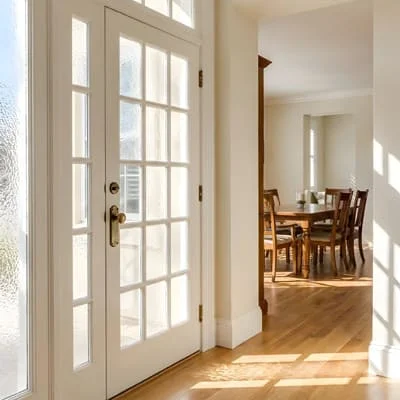
Open vs. closed floor plans and decor implications
The broader architectural question of open versus closed floor plans, which I’ve written about in real depth in relation to residential architectural style elsewhere on this site, carries direct and significant decor implications that deserve treatment here specifically. An open floor plan — connecting kitchen, dining, and living spaces into a single continuous volume — requires the whole-home color and material coordination I discussed earlier in this guide considerably more urgently than a home built around discrete, separately closable rooms, since an open plan makes every connected zone simultaneously visible in a way a closed floor plan simply doesn’t.
Furniture in an open plan also takes on a genuinely different decor function than it does in a closed room, since it’s frequently the primary tool available for establishing the zoning distinctions that walls and doors would otherwise provide. A well-placed area rug, a strategically positioned sofa back, or a considered lighting transition between zones can all perform much of the spatial-definition work that a wall would perform in a more traditional, closed floor plan, and I generally encourage clients working within an open-plan layout to think about furniture placement explicitly in these zoning terms, rather than purely in terms of individual piece comfort and appearance considered in isolation.
Closed floor plans, by contrast, offer genuinely more freedom for dramatic, room-specific decor decisions, since each room can diverge considerably from its neighbors without producing the visual disconnect I described earlier as a risk in open, continuously visible spaces. This isn’t a case where one approach is objectively superior to the other — it’s a genuine trade-off between the connected, expansive feel an open plan offers and the more contained, individually expressive decor freedom a closed plan provides, and understanding which trade-off your own home’s architecture has already made for you is a genuinely useful piece of information heading into any decorating project.
Hardware, finishes, and small architectural details
Hardware — door handles, hinges, cabinet pulls, switch plates — occupies a genuinely disproportionate share of a home’s overall perceived quality relative to its actual cost, precisely because these small details are touched and noticed constantly, at close range, in a way larger decor decisions like a sofa or a wall color simply aren’t experienced with the same frequency of direct physical contact.
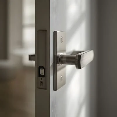
Consistency in hardware finish across a connected space matters for the same whole-home coherence principle I established earlier in relation to color: hardware finishes that vary inconsistently from room to room, without a clear organizing logic, tend to read as unplanned rather than intentionally varied, in the same way a genuinely successful eclectic decor scheme still relies on some underlying connecting principle rather than true randomness.
I generally recommend establishing one or two primary hardware finishes for a whole connected living area, allowing genuine variation in secondary, more private spaces like individual bedrooms if a household wants that flexibility.
Small architectural details beyond hardware — baseboard and trim proportion, switch plate style, the finish and profile of door casings — deserve the same material-honesty consideration I’ve applied throughout this guide to larger decisions. A home with an otherwise carefully considered decor scheme can still feel subtly unfinished if these small, constantly-touched details were selected as an afterthought rather than considered as part of the same coherent material and style logic running through every other decision in the space.
Designing transitions between rooms
I want to close this section by returning to the threshold itself — the genuine transition moment between one room and the next — since I think it deserves the same deliberate design attention I gave to garden thresholds and entryways elsewhere on this site. A transition between rooms is an opportunity for the same pacing and anticipation effect I described in relation to garden path sequencing: a considered threshold, whether marked by a change in flooring material, a shift in lighting quality, or simply a beautifully proportioned doorway itself, gives a home a genuine sense of sequence and depth as you move through it, rather than every space blurring into the next without any marked distinction.
This matters particularly at the transition between more public, social spaces and more private, restful ones — the shift from a living or dining area into a bedroom hallway, for instance, benefits from a genuinely considered change in lighting warmth, color temperature, or even scent, signaling a shift in the home’s pace and mood that supports the different function of the space being entered. I think of these threshold moments as some of the highest-value, lowest-cost design opportunities available in an entire decorating project, since a genuinely considered transition — sometimes as simple as a change in door style, a shift in artwork tone, or a deliberate lighting cue — does a disproportionate amount of work toward making a home feel like a genuinely sequenced, considered whole, rather than a collection of individually decorated rooms that happen to share a common structure.
Designing Rooms for Specific Life Stages and Uses
Nurseries and baby rooms: materials, light, and calm
Nurseries present a genuinely distinct design brief from almost any other room covered in this guide, since the priorities shift decisively toward material safety, sensory calm, and a level of flexibility that anticipates a child’s rapid developmental changes over just the first few years of use. Material choice matters more directly here than in almost any other room in a home, since a baby spends an enormous amount of direct physical contact time with surfaces, textiles, and finishes that, in an adult-oriented room, would carry considerably lower physical-contact stakes.
Natural materials — solid wood furniture, natural fiber textiles, low- or zero-VOC paints and finishes — genuinely matter here beyond their aesthetic appeal, given the sustained close proximity and developing respiratory and skin sensitivity of a very young child, and I generally encourage this as a room where the material-honesty principle running throughout this guide isn’t simply a style preference but a genuinely practical priority. Soft, diffused, dimmable lighting supports both a calming daytime environment and the very different, considerably lower-light needs of nighttime feeding and settling, making the layered, adjustable lighting approach I described earlier in this guide particularly valuable in this specific room, arguably more valuable here than in any other space in the home.
Color and pattern in a nursery benefit from the same calming, restful palette principles I described earlier in relation to bedrooms generally, though I’d add that a nursery specifically benefits from restraint in visual stimulation more broadly — a very young child’s sensory environment doesn’t yet benefit from the kind of rich pattern and color complexity that might genuinely enhance an adult space, and a calmer, more muted palette generally supports better sleep and emotional regulation in this specific context than a bold, highly stimulating one would.
Home offices and creative/media rooms
Home offices and creative spaces require a decor approach built primarily around genuine functional support for focus and productivity, which I think distinguishes them meaningfully from almost every other room covered in this section, where mood and personal expression carry relatively more weight against pure function. Task lighting, discussed in real depth earlier in this guide, deserves particular priority here — a home office lit primarily by ambient light alone, without a genuinely well-positioned task light at the actual working surface, undermines focus and visual comfort in ways that are easy to underestimate until they’re actually corrected.
Color choice in a focus-oriented room benefits from the same cooler, more muted principles I described earlier for rooms needing concentration rather than social energy, though I’d add that a completely sterile, colorless home office can undermine motivation and creative energy just as much as an overstimulating one can undermine focus — the goal is a genuinely calibrated middle ground, informed by the specific kind of work actually being done in that space, whether that’s detail-focused administrative work benefiting from a calmer palette, or genuinely creative work that might benefit from somewhat more visual stimulation and personal object display than a purely administrative workspace would.
Media and creative rooms used for content creation, video work, or entertainment carry an additional acoustic consideration I’ve touched on elsewhere on this site in relation to garden media spaces, and the same principle applies directly indoors: sound-absorbing materials — soft textiles, upholstered furniture, strategically placed acoustic panels disguised as decor — genuinely improve both the comfort of a room used for extended media consumption and the practical audio quality of any content actually recorded within it, a functional consideration that deserves to be integrated into the room’s decor plan from the outset rather than addressed reactively after a poorly performing recording reveals the problem.
Bedrooms designed for rest
Bedrooms deserve to be designed around rest as their primary, non-negotiable function, and I think this is a room where the temptation to prioritize how a space photographs over how it actually supports sleep is particularly worth resisting, given how directly a bedroom’s decor decisions affect genuine physical wellbeing rather than purely aesthetic satisfaction.
Lighting deserves particular attention in a bedroom specifically because of how directly it interacts with genuine sleep physiology — warm, dimmable light in the evening supports the body’s natural transition toward rest, while bright, cool-toned light in this same space in the evening hours can genuinely work against a household’s ability to wind down, regardless of how well every other decor decision in the room has been executed.
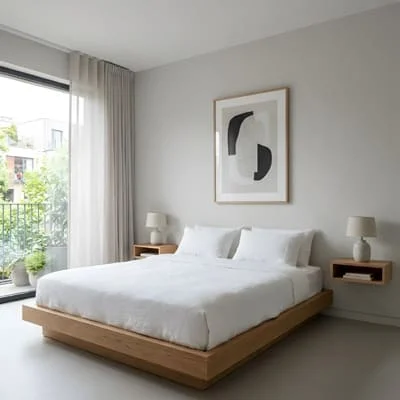
Textiles carry disproportionate weight in a bedroom’s overall comfort relative to almost any other decor category, since bedding, in particular, is experienced through direct, sustained physical contact rather than primarily through sight, in the same way I discussed nursery material choice earlier in this section. I generally encourage clients to prioritize genuine textile quality — natural fiber content, weave, and weight suited to their specific climate — over purely visual textile choices in a bedroom specifically, since the functional, physical experience of a bedroom’s textiles matters more here than in almost any other room covered in this guide.
Multipurpose and flexible-use spaces
Multipurpose rooms — a guest room doubling as a home office, a living space that needs to accommodate both quiet family time and larger entertaining, a child’s room designed to evolve as they grow — present a genuinely distinct design challenge: decor decisions need to support multiple, sometimes competing functions without any single function’s needs compromising the others so significantly that the room fails at all of them simultaneously.
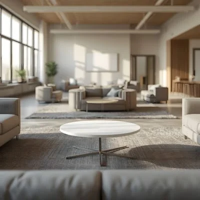
The zoning principle I introduced in relation to garden design elsewhere on this site applies directly indoors to multipurpose rooms as well: even within a single room, establishing clear, even if modestly sized, zones for each distinct function — a defined work corner within a guest bedroom, a clearly bounded reading nook within a larger multipurpose living space — tends to produce a considerably more functional and visually coherent result than allowing every function to bleed together across the entire room without any spatial distinction at all.
Furniture flexibility is the second tool I rely on heavily in genuinely multipurpose spaces, favoring pieces that can genuinely serve more than one function well — a daybed that works as both genuine guest seating and comfortable overnight sleeping, a desk with enough visual refinement to remain presentable as a guest room’s primary furniture piece rather than reading as an obviously utilitarian intrusion into an otherwise considered space. I’d add one honest caution here: a room trying to serve too many genuinely incompatible functions simultaneously, without any prioritization of which function actually matters most, tends to satisfy none of them particularly well, and I generally encourage clients to identify a genuine primary function for any multipurpose space, designing the room’s core decor decisions around that priority while accommodating secondary functions as a genuine but clearly secondary consideration.
Materials and Textures That Define Interior Style
Natural materials vs. engineered/synthetic alternatives
I’ve referenced material choice at several points throughout this guide, and I want to bring that discussion together here into the same direct comparison I’ve made in relation to architecture and garden design elsewhere on this site, because the underlying trade-offs are genuinely consistent across every scale of design decision. Natural materials — solid wood, natural stone, genuine leather, natural fiber textiles — offer an authenticity and aging character that manufactured alternatives can’t fully replicate, developing patina and texture over time that’s generally treated as a feature rather than a flaw, in the same way I discussed natural material aging in relation to Craftsman architecture and natural wood detailing elsewhere on this site.
Engineered and synthetic alternatives — engineered wood products, manufactured stone veneer, performance textiles, synthetic leather — offer genuine advantages in cost, consistency, and, in many cases, durability against specific stresses natural materials handle less gracefully, such as sustained moisture exposure or heavy daily wear in a high-traffic household. The decision between natural and engineered materials shouldn’t be treated as a uniform choice applied identically across an entire home, in my experience, but rather made deliberately, room by room and application by application, based on genuine exposure conditions and the specific priority — authenticity, budget, durability — that matters most for that particular decision.
I generally advise clients to prioritize natural materials specifically in applications where they’re most visible and most directly touched — a dining table surface, a genuinely close-contact textile, a floor in a primary living space — while accepting engineered or synthetic alternatives more readily in less visible or less directly experienced applications, which mirrors the same guidance I’ve offered in relation to solid versus engineered wood in architectural detailing: use the premium, authentic material where its authenticity genuinely registers, and use the more practical, cost-effective alternative everywhere else, rather than treating the decision as an all-or-nothing commitment across an entire project.
Textiles, texture layering, and tactile comfort
Textiles deserve treatment as one of the most important, and most consistently underinvested, decor categories covered in this entire guide, since they carry an enormous share of a room’s actual physical comfort and perceived warmth relative to their cost, in a way that’s genuinely disproportionate to how much decorating attention and budget most households allocate toward them compared to furniture and larger fixed decisions.
Layering textiles by texture, in the same deliberate way I’ve described layering plants by height in garden design and light by function earlier in this guide, is what produces a room’s sense of tactile richness and genuine comfort.
A room relying on a single textile texture throughout — one uniform upholstery fabric, one flat rug texture, no variation in throw pillow or blanket material — tends to feel considerably flatter and less inviting than the same room incorporating genuine textural variety: a nubby wool alongside a smooth linen, a plush pile rug alongside a woven leather accent, a variety that engages the sense of touch in a way a visually coordinated but texturally uniform room simply doesn’t.
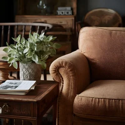
I’d also emphasize that textile choice should be genuinely informed by climate, in the same way I’ve discussed climate-responsive material choice throughout my architecture and garden writing on this site. Heavier, insulating textiles — wool, substantial weaves, layered blankets — genuinely serve a cooler climate’s comfort needs in a way lighter, breathable textiles like linen and cotton serve a warmer climate’s needs, and choosing textile weight and fiber content based on genuine climate suitability, rather than purely on appearance, produces a home that’s actually comfortable to live in year-round rather than one that simply photographs well regardless of season.
Sustainable and healthy material choices
Sustainability in interior material choice has followed the same trajectory I’ve described in relation to architecture and garden design elsewhere on this site: moving from a niche, optional consideration to something closer to a baseline expectation, and for very similar underlying reasons. Low- and zero-VOC finishes, genuinely responsibly sourced wood and natural fiber products, and materials free of the more concerning synthetic compounds that were standard even a decade ago have shifted from a premium, hard-to-source specialty request to something close to a mainstream expectation across a growing share of the projects I’m involved in now.
Beyond the environmental dimension, I think the health dimension of material choice deserves equal weight, particularly given the nursery and bedroom discussion earlier in this section, where sustained close physical contact with materials genuinely matters for occupant wellbeing, not just environmental impact in the abstract. Indoor air quality, directly affected by the finishes and materials used throughout a home’s interior, is a consideration I encourage every client to weigh seriously, particularly in rooms where household members spend the most sustained time, such as bedrooms and any home office or creative space used for extended daily periods.
How materials signal quality and value
I want to close this section by drawing the same connection I made in relation to architectural material choice elsewhere on this site: material authenticity is one of the clearest, least fakeable signals of genuine quality and considered design available to anyone experiencing a room, whether that’s a guest, a potential buyer, or simply the household living there day to day, and it’s a signal people respond to well before consciously articulating why.
A room furnished with genuine natural materials in its most visible, most directly experienced applications reads as considered and well cared for, even when the overall budget behind that room was genuinely modest, while a room relying heavily on visibly synthetic materials in high-contact, high-visibility applications can undermine an otherwise well-executed color, lighting, and layout plan, regardless of how much was actually spent on those other decisions. This is precisely why I encourage every client, working through the budgeting section later in this guide, to prioritize genuine material quality in the specific applications where it registers most directly, rather than distributing a limited budget evenly across every material decision in a project without regard to which ones actually carry the most weight in how that room is ultimately experienced and valued.
Organization and Functional Decor
Storage as a design decision, not an afterthought
Storage is a decor category I think gets treated with less design seriousness than almost any other element covered in this guide, typically addressed reactively once a space has already become cluttered rather than planned deliberately from the outset — and I want to be direct about why I think that sequencing is genuinely backward. A room’s storage capacity directly determines how well it can sustain the curated, uncluttered quality I described earlier in relation to minimalist decor and personal object curation, regardless of how carefully every other decor decision in that room has been made.
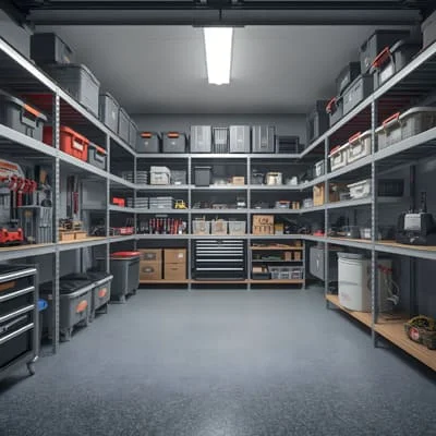
I generally encourage clients to plan storage at the same stage I recommend planning lighting and color — early, alongside the room’s fundamental layout, rather than as a separate concern addressed after furniture and decor decisions are already finalized.
Built-in storage, in particular, offers a genuine design advantage over furniture-based storage added later: a considered built-in solution can be sized and positioned to match a room’s specific proportions and architectural features exactly, in a way a generic purchased storage piece, chosen after the fact to fit whatever space happens to remain, rarely achieves as successfully.
Storage should also be designed with genuine visibility in mind — deciding deliberately which items benefit from being displayed and which genuinely function better concealed, rather than defaulting to open shelving throughout a space purely for its current aesthetic popularity, or conversely, concealing everything behind closed doors regardless of whether a given item would actually benefit from being part of the room’s visible decor scheme. This decision connects directly back to the object curation discipline discussed earlier in this guide: items chosen through genuine curation for their personal or aesthetic value generally belong displayed, while items kept purely for function or habit, without particular aesthetic value, generally belong concealed.
Practical hacks that improve daily comfort
Beyond structural storage planning, a range of smaller, more immediately actionable adjustments can meaningfully improve a room’s daily comfort and function without requiring a full redesign, and I think these deserve genuine attention in their own right, since they’re often the most cost-effective improvements available relative to their actual impact on how a space is lived in day to day.
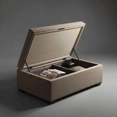
Multi-functional furniture — an ottoman with genuine internal storage, a bed frame with built-in drawers, a console table sized to double as a functional workspace — extends a room’s practical capacity without requiring additional floor area, which matters particularly in the smaller and multipurpose spaces discussed earlier in this guide. Cable and technology management, genuinely underaddressed in most decorating advice, deserves deliberate planning specifically because visible cables and cords undermine an otherwise carefully considered room more consistently and more noticeably than most homeowners initially expect, given how directly they interrupt the clean sightlines and material coherence this entire guide has emphasized throughout.
Reconsidering furniture arrangement itself, without any new purchases at all, is often the single highest-impact, lowest-cost improvement available to a room that isn’t currently functioning well, and I’d encourage any reader feeling genuinely stuck with an underperforming space to revisit the room audit principles established early in this guide — sightlines, traffic flow, and genuine daily-use patterns — before assuming new furniture or a full redecoration is actually required to solve what might simply be an arrangement problem.
Decluttering without losing personality
Decluttering, approached purely as removal without any deliberate curation strategy, risks producing exactly the cold, impersonal result I cautioned against earlier in this guide’s discussion of minimalism — and I think the distinction between thoughtless removal and genuine curated editing is worth making explicit here, since the two produce very different outcomes despite superficially similar processes.
The curation discipline I described earlier — genuinely asking what personal or aesthetic significance a given object actually carries — applies directly to decluttering as well, and I generally encourage clients to approach the process by identifying what genuinely deserves to stay, based on real significance or function, rather than starting from the opposite framing of simply deciding what to remove. This subtle reframing tends to produce a genuinely more considered result, since it keeps the personal-meaning pillar established at the start of this guide actively in view throughout the process, rather than treating decluttering purely as a volume-reduction exercise disconnected from what actually makes a space feel like it belongs to the people living in it.
I’d also note that decluttering is rarely a single, one-time event, in the same way I described garden design as an ongoing relationship rather than a fixed, permanent outcome elsewhere on this site. A household’s genuine possessions and priorities shift over time, and revisiting a space’s object curation periodically — rather than treating an initial declutter as a permanent final state — tends to keep a room feeling genuinely current and personally relevant considerably longer than a single intensive effort followed by years of unreflective accumulation.
Designing for real households (kids, pets, guests)
I want to close this section with an honest acknowledgment that most of the decor principles covered throughout this guide need to flex meaningfully when applied to a household that includes children, pets, or frequent guests, since these genuine daily-use realities change what “successful” decor actually means in practical terms, beyond purely aesthetic considerations.
Material durability deserves particular reconsideration here relative to the natural-versus-synthetic discussion earlier in this guide — a household with young children or pets often benefits from prioritizing genuinely durable, cleanable materials in high-contact zones specifically, even where a natural material might otherwise be preferred on purely aesthetic or tactile grounds, since a beautiful material that shows every mark and requires constant, anxious maintenance ultimately undermines a household’s actual quality of life more than a slightly less premium but genuinely more practical alternative would in that same high-stress application.
Layout and storage planning also deserve genuine reconsideration for households with these specific needs — accessible, genuinely usable storage for children’s frequently used items, durable and easily cleaned surfaces in a home’s most heavily trafficked pet zones, and flexible guest accommodation that doesn’t require a household to fundamentally reorganize an entire room every time visitors arrive. I generally encourage clients in this situation to treat these real, ongoing household realities as genuine design inputs from the very start of a project, in the same way I’ve emphasized honest site and household analysis throughout every guide I’ve written on this site, rather than designing an idealized space first and then discovering, through frustrating trial and error, which decisions don’t actually hold up against how the household genuinely lives day to day.
Budgeting and Sourcing: Affordable to Luxury Decor
Affordable decor trends that still look intentional
Working within a genuinely modest budget doesn’t require abandoning the systemic, intentional approach to decor established throughout this guide — in fact, I’d argue the principles covered so far matter more, not less, when budget is constrained, since there’s less room to compensate for a poorly considered decision with sheer additional spending.
The single highest-leverage, lowest-cost decision available to almost any budget-conscious project is color and lighting, both covered in real technical depth earlier in this guide, since paint and lighting adjustments deliver disproportionate visual impact relative to their cost compared to furniture or structural changes. A carefully chosen, well-tested color paired with a genuinely layered lighting plan can transform a room’s perceived quality considerably more than an expensive furniture purchase made without equivalent attention to the light and color it will actually be seen within.
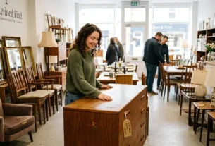
Curated secondhand and vintage sourcing, approached with the same discipline I described in relation to object curation earlier in this guide, offers genuine access to material authenticity and character at price points considerably below equivalent new purchases, provided a household is willing to invest the time in sourcing pieces that genuinely fit the room’s established color, material, and proportion logic rather than acquiring items opportunistically without regard to whether they actually belong in the specific scheme being built.
Luxury decor investment pieces worth prioritizing
For clients working with genuinely more flexible budgets, I generally recommend concentrating investment in the specific decisions that carry the most disproportionate long-term impact, rather than distributing a larger budget evenly across every category covered in this guide.
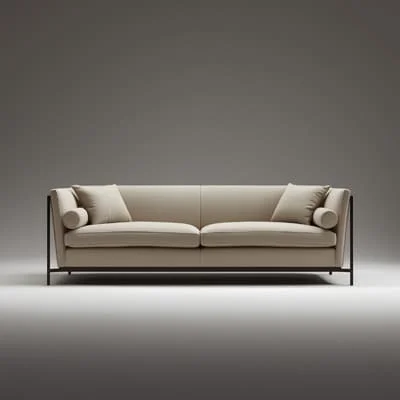
Foundational furniture pieces — a genuinely well-constructed sofa, a dining table built to last decades rather than years — reward premium investment more reliably than more easily and affordably updated decorative elements, since these pieces anchor a room for a considerably longer period and are more disruptive and expensive to replace than a lower-cost accent piece or textile.
DIY projects that add real value
DIY projects occupy a genuinely useful middle ground between the affordable and luxury approaches discussed above, offering a path to material and craftsmanship quality that would otherwise require a considerably larger budget, provided a project is genuinely matched to the skill level and available time of the person undertaking it. I generally encourage clients considering a DIY approach to prioritize projects with a favorable ratio of skill difficulty to visual and functional impact — a well-executed paint or textural wall finish, discussed earlier in this guide, is considerably more forgiving and achievable for a genuine beginner than structural carpentry or electrical work, which carries real safety implications and generally deserves professional execution regardless of a household’s DIY enthusiasm.
I’d also flag a specific risk worth taking seriously here: an ambitious DIY project attempted beyond a household’s genuine skill level, and left visibly unfinished or poorly executed, tends to undermine a room’s overall coherence more significantly than simply not attempting that particular improvement at all would have. Being genuinely honest about skill level and available time before committing to a DIY project, rather than assuming enthusiasm alone will be sufficient, is a discipline that consistently separates DIY efforts that add real, lasting value from ones that require expensive professional correction later.
Where to splurge vs. where to save
I want to close this section with a practical framework that ties the affordable, luxury, and DIY discussions together into a single decision principle applicable across almost any budget level: splurge on the decisions that are most expensive and disruptive to change later, and save on the decisions that are genuinely easy and low-risk to update over time as budget allows or as personal taste evolves.
Structural and built-in decisions — flooring, built-in storage, major lighting infrastructure, foundational furniture pieces — belong firmly in the splurge category, since correcting a poor decision in any of these areas later is considerably more expensive and disruptive than getting it right from the outset. Decisions that are genuinely easy to change — accent textiles, smaller decorative objects, accent lighting fixtures, wall art — belong in the save category, since these can reasonably be acquired more affordably initially and upgraded incrementally over time without requiring the same disruptive, all-at-once investment that structural decisions demand. This framework, more than any single specific budget allocation, is the principle I’d encourage every reader of this guide to actually apply to their own project, regardless of their total available budget.
How to Choose a Personal Decor Style
Matching decor to your home’s architecture
I raised the connection between decor and architecture early in this guide, and I want to return to it now as a genuinely practical starting filter for narrowing down a personal style direction, since I think it’s the single most useful tool available for making this decision less overwhelming than it often feels when approached purely through aesthetic preference alone.
A home’s existing architectural style, established through the same roofline, proportion, and material vocabulary I’ve written about extensively elsewhere on this site, already suggests a decor direction that will feel genuinely coherent rather than imposed. A Contemporary or Mid-Century Modern home, built around clean lines and a strong indoor-outdoor connection, tends to support a decor approach built around the same restraint and material honesty covered throughout this guide’s discussion of minimalism and natural materials.
A Craftsman, Farmhouse, or Cottage-style home, built around visible structure and natural material warmth, tends to support a decor approach leaning more heavily into texture, natural materials, and the personal-object curation discussed earlier in this guide, rather than a strictly minimal, pared-back aesthetic that would sit uneasily against that home’s more expressive architectural character.
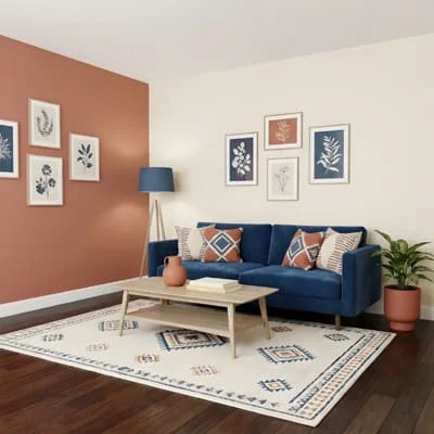
This doesn’t mean a home’s architecture rigidly dictates its interior decor without any room for personal variation — I’ve worked on plenty of successful projects where a client’s personal style diverges deliberately and confidently from their home’s original architectural vocabulary, in the same way I’ve discussed deliberate architectural style contrast elsewhere on this site. But for the majority of readers working through a first significant decorating project, starting from genuine architectural coherence, rather than choosing a decor direction purely from inspiration photographs taken in an entirely different architectural context, tends to produce a result considerably more likely to feel intentional and well suited to the actual home it’s applied within.
Matching decor to lifestyle and household needs
Beyond architectural coherence, I always encourage clients to weigh their genuine daily lifestyle and household composition as heavily as aesthetic preference when choosing a personal style direction, since a decor approach that looks wonderful in principle but doesn’t genuinely suit how a household actually lives day to day tends to create ongoing friction regardless of how carefully every individual decision was otherwise made.
This connects directly back to several threads covered throughout this guide: the durability and household-specific considerations discussed in the organization section, the room-specific functional priorities covered in the life-stage design section, and the honest budget-allocation discipline covered in the previous section. A household that entertains frequently genuinely benefits from prioritizing the social-space decor decisions discussed throughout this guide, while a household prioritizing quiet, restful daily life benefits more from the calming color, lighting, and material choices I’ve described in relation to bedrooms and retreat spaces specifically.
I generally encourage clients to think of lifestyle fit as a genuine filter applied after initial aesthetic inspiration, rather than ignored in favor of pure visual preference — an aesthetic that looks striking in an inspiration photograph but doesn’t actually accommodate how a specific household lives, works, and relaxes day to day will consistently underperform relative to a less visually dramatic but genuinely well-matched alternative, in the same way I’ve emphasized honest functional fit throughout every section of this guide.
Evolving your style over time without a full redo
I want to address a question I hear constantly from clients partway through a decorating project or living in a space for several years: how to genuinely evolve a home’s style over time without requiring the expense and disruption of starting completely over, since very few households have the budget or inclination to fully redecorate a home from scratch on any regular basis.
The whole-home color and material strategy discussed earlier in this guide is genuinely useful here as well, since a home built around a coherent underlying palette and material logic can absorb considerable stylistic evolution over time without losing its overall coherence, provided new additions genuinely relate to that established underlying logic rather than introducing an entirely disconnected new direction all at once. Updating the more easily changed decor layers identified in the previous section’s splurge-versus-save framework — accent textiles, art, smaller decorative objects — allows a home’s style to shift and grow considerably over time without requiring disruption to the structural, foundational decisions that remain genuinely expensive and difficult to change.
I also think the object-curation discipline established earlier in this guide is directly relevant to style evolution specifically: a household’s genuine personal significance and taste shift over years, and periodically revisiting which objects, colors, and decisions still genuinely reflect who’s currently living in a space — rather than assuming an initial decorating decision should remain permanently fixed regardless of how the household itself has changed — keeps a home feeling authentically current rather than frozen at whatever point its most significant original decorating effort happened to occur.
Common mistakes when mixing decor styles
I want to close this section with the mistakes I see most consistently when clients attempt to mix decor styles, since — much like the architectural and garden style-mixing mistakes I’ve covered extensively elsewhere on this site — nearly every one traces back to combining surface-level elements from different styles without understanding what actually holds each individual style together as a coherent system.
The most common mistake is combining pieces from different styles based purely on individual appeal, without any unifying thread connecting them — a room assembled this way tends to read as genuinely unplanned rather than intentionally eclectic, precisely because true eclectic style, executed well, still relies on some consistent organizing principle, whether that’s a shared color palette, a consistent material logic, or a genuine curatorial theme, in the same way I described successful gallery walls and mixed-medium art displays earlier in this guide. The second common mistake is ignoring the proportion and scale principles established early in this guide when introducing pieces from a different style tradition — a delicately scaled traditional piece can genuinely clash with the bolder proportions typical of much contemporary furniture, not because the two styles are inherently incompatible, but because their scale relationship simply hasn’t been considered deliberately.
The third mistake, and one I think connects directly back to the very first pillar established at the start of this guide, is mixing styles without regard to how they interact with a room’s actual light conditions — a style built around deep, saturated color and dense pattern can work beautifully in one room’s light conditions and read as genuinely oppressive in another, regardless of how successfully that same style might photograph in an entirely different lighting context. Avoiding these three mistakes specifically, more than any particular stylistic combination itself, is what separates a home that mixes styles with genuine confidence from one that simply reads as visually inconsistent.
Decorating a Home That Feels Like You
Every principle covered throughout this guide — reading a room honestly before decorating it, understanding light and color as a connected system rather than separate decisions, layering texture and material with genuine intention, and curating personal objects rather than accumulating them by default — ultimately serves the same underlying goal I named at the very start of this guide: a home with genuine style, in the specific sense I’ve used that word throughout, is one where every decision supports every other decision, rather than a collection of individually appealing choices that happen to share the same physical address.
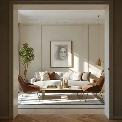
The skills involved in achieving that kind of coherent, personal style aren’t reserved for professional designers.
They’re a sequence of honest observations and deliberate decisions, applied in the right order and revisited periodically as a household and its needs genuinely evolve, that any reader of this guide can develop and apply in their own home, at whatever budget and scale their current project actually calls for.
A home, like a garden, is never truly finished — it continues to change alongside the people living in it, and designing with that ongoing relationship in mind, rather than expecting a single, permanent outcome, is what allows a home to keep feeling genuinely, increasingly like the people who actually live there, rather than a fixed style statement frozen at whatever moment its most significant decorating effort happened to occur.
Frequently Asked Questions (FAQ)
How do I start decorating my home from scratch?
Begin with the room audit covered early in this guide — genuinely observe your natural light across a full day, note your room’s actual proportions and architectural fixed points, and consider how the space is genuinely used day to day. Only after this audit should you move to color, lighting, and furniture, in that sequence, since choosing furniture or paint before understanding your room is the single most common mistake covered throughout this guide.
What’s the best lighting setup for a small home?
Layered lighting matters more, not less, in a small home, since a single central ambient fixture tends to flatten a small room’s sense of depth considerably more noticeably than in a larger space. Prioritize a mix of ambient, task, and accent lighting even in a modest footprint, and favor warmer color temperatures and dimmable options that allow a small space to shift comfortably between daytime function and evening coziness.
How do I choose a color palette for my whole house?
Establish a limited palette of two to four core, genuinely related colors intended to recur across your connected living spaces, prioritizing careful coordination specifically at the sightlines between rooms that are visible from the same vantage point, as covered in detail earlier in this guide. Test any color at real scale under your rooms’ actual light conditions before committing, rather than relying on a small swatch or a photograph taken in different lighting entirely.
Can I mix decor styles in one home?
Yes, and it can work very successfully, provided you maintain a unifying thread — a consistent color palette, material logic, or genuine curatorial theme — connecting the different styles, rather than combining surface-level elements from each without any organizing principle. The same understanding of what holds each individual style together that I’ve emphasized throughout my architecture and garden guides applies directly to mixing decor styles as well.
What decor changes offer the best return on investment?
Color and lighting improvements consistently offer the most disproportionate visual impact relative to cost, as covered in the budgeting section of this guide, followed by genuine material quality upgrades in a room’s most visible, most directly touched applications. Structural and foundational decisions — flooring, built-in storage, major lighting infrastructure — deserve the largest share of a generous budget specifically because they’re the most disruptive and expensive to correct later if under-invested initially.

Architect with extensive experience in residential and commercial design, including renovations and modular construction. Love to share information about Architecture, home and lifestyle in this blog.