
Give the style and photographing home decor for Instagram and Pinterest requires a thoughtful approach that balances organization, decor elements, and colour. Mastering these aspects is essential to create calm, intentional, and human-centered images that resonate with your audience. Understanding how to organize your space effectively while selecting the right decor elements and color palette can transform your photos into architectural narratives rather than merely decorative snapshots.
Thank you for reading this post, don't forget to subscribe!Many struggle with creating visually appealing content that reflects real living environments without overwhelming the senses. The challenge lies in achieving a calm and slow aesthetic that feels grounded and intentional, especially in the fast-paced world of social media. This article explores practical methods to organize, select decor elements, and use colour strategically to elevate your home styling and photography for Instagram and Pinterest.
From foundational styling tips to advanced photographic techniques, you will learn how to convey an architectural story through your images, emphasizing climate awareness and international design principles. Let’s dive into how to harmonize organize, decor elements, and colour for captivating, authentic home decor photography.
Organizing Your Space for Impactful Home Decor Photography
Creating a Functional Layout That Enhances Decor Elements
Organizing your space starts with a functional layout that supports the decor elements and color scheme. Prioritize flow and accessibility, ensuring that furniture and accessories complement one another without cluttering the frame. A balanced arrangement highlights key pieces and allows natural light to enhance textures and colors. Architectural principles like proportion and scale guide this process, making sure every element serves a purpose beyond decoration.
Integrate storage solutions that maintain a clean, calm environment. This reduces distractions and directs focus to the carefully curated decor elements. The goal is to create a slow, deliberate mood that invites viewers to appreciate the space’s intent and craftsmanship.
Consider how each item interacts with the room’s structure, using neutral backdrops to amplify colour accents and material contrasts. This thoughtful organization is the foundation for compelling images that reflect how people truly live.
Maximizing Natural Light to Showcase Colour and Texture
Natural light plays a critical role in organizing visual hierarchy within your photos. Position decor elements where daylight accentuates textures and colours without causing harsh shadows or glare. Soft, diffused light enhances warmth and depth, making colors appear truer to life, which is fundamental for authentic architectural photography.
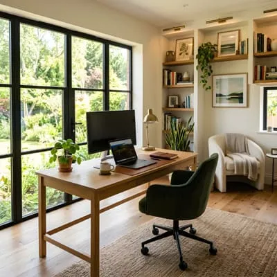
Be mindful of the time of day; morning and late afternoon light tend to create the calm, intentional atmosphere that aligns with human-centered design.
Adjust window treatments and furniture placement to optimize lighting conditions, ensuring the decor elements are seen in their best form.
Using reflectors or light-colored surfaces can bounce light into darker corners, maintaining balance across the composition and supporting a cohesive color story.
Essential Tips for Organizing Decor Elements Efficiently
- Group items by theme or material to create visual coherence.
- Use negative space strategically to avoid clutter and highlight focal points.
- Rotate decor elements seasonally to keep content fresh and climate-aware.
- Incorporate natural materials that resonate with the local environment.
- Maintain a palette that supports calm and intentional living.
These tips help maintain a consistent style that is both grounded and international, appealing to diverse audiences while respecting the space’s climatic context.
Choosing Decor Elements That Reflect Purpose and Style
Balancing Functionality with Aesthetic Appeal
Decor elements should be selected for their dual role: practical use and visual interest. Furniture, textiles, and accessories must harmonize with the architectural bones of the space, enhancing comfort without detracting from the overall design intention. Prioritize pieces that serve the lifestyle and reinforce the calm, slow aesthetic.
Intentionality is key when selecting each decor element. Avoid purely decorative or trendy items that lack purpose. Instead, focus on timeless materials and forms that amplify the human-centered approach and sustainability principles.
This balance creates a narrative that feels lived-in but carefully curated, inviting viewers into an environment that supports wellbeing and authenticity.
Incorporating Colour to Define Ambiance and Mood
Colour is a powerful tool that shapes perception and emotional response. Use it deliberately to establish a calm and inviting atmosphere. Earth tones and muted palettes often evoke warmth and slow living, while accent colours can create focal points without overwhelming the senses.
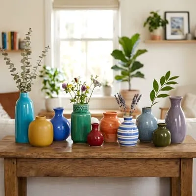
Layer different shades and textures within the chosen colour scheme to add depth and sophistication.
Consider how natural light interacts with these colours throughout the day to maintain a consistent mood that complements the architectural setting.
Colour choices should also reflect climate awareness; for example, lighter hues in warmer regions to reflect heat and darker tones in cooler climates to absorb warmth.
Materials and Textures That Complement Colour and Space
- Natural woods and stone for grounding warmth
- Soft linens and cottons for tactile comfort
- Metal accents for subtle contrast and modernity
- Matte finishes that reduce glare and enhance colour depth
- Handcrafted elements that add authenticity and character
These materials support an architectural narrative, emphasizing the connection between decor elements, colour, and the physical environment. Their thoughtful integration elevates the overall design impact.
Utilizing Colour Theory to Enhance Visual Storytelling
Understanding Colour Harmonies for Cohesive Styling
Colour theory provides a framework for combining hues that work harmoniously within your space. Complementary, analogous, and monochromatic schemes help organize decor elements visually, ensuring balance and unity.
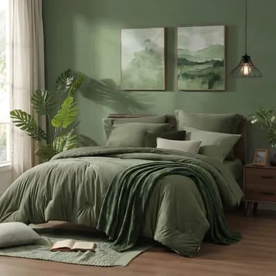
Employing these principles allows you to create compositions that feel intentional and grounded rather than chaotic.
By understanding the emotional and psychological effects of different colours, you can craft environments that calm the viewer and invite slow engagement. This approach aligns with a human-centered design philosophy, where colour serves the wellbeing of inhabitants.
Apply these harmonies consistently across decor elements to maintain a fluid narrative that translates well in photographs.
Using Colour Contrast to Highlight Key Decor Elements
Contrast directs the eye and creates visual interest, essential for effective photography on social platforms. Use colour contrasts to emphasize focal decor elements or architectural features, helping them stand out against more neutral surroundings.
This technique guides the viewer’s journey through the image, enhancing storytelling.
Be cautious not to overuse high contrasts, which can disrupt the calm and intentional mood. Subtle contrasts between muted tones often yield a more sophisticated, international aesthetic suited for climate-aware interiors.
Strategic contrast also supports accessibility by improving legibility and visual clarity.
Colour Trends Versus Timeless Palettes
- Incorporate trending colours sparingly as accent pieces.
- Favor timeless neutrals for foundational decor elements.
- Experiment with natural, climate-responsive palettes.
- Balance cool and warm tones to suit the architectural context.
- Use colour to reflect personal and cultural identity authentically.
- Maintain consistency to build a recognizable style.
- Adapt palettes seasonally without losing the overall coherence.
Prioritizing timeless palettes over fleeting trends ensures your content remains relevant and grounded in architectural integrity.
Photographing Decor Elements: Techniques for Authentic Representation
Choosing the Right Equipment and Settings
To authentically capture decor elements and colour, use cameras and lenses that provide sharp detail and accurate color reproduction. Prime lenses with wide apertures allow for controlled depth of field, emphasizing focal points while softly blurring backgrounds. Shooting in RAW format preserves maximum image data for post-processing adjustments.
Manual settings help manage exposure and white balance, vital for consistent color representation. Avoid harsh flash lighting; rely on natural or diffused artificial light to maintain the space’s calm ambiance.
Invest in a tripod to stabilize your shots, especially in low light, ensuring crisp, professional images.
Composing Shots That Reflect Calm and Intentional Living
Composition should align with architectural values—balance, proportion, and rhythm. Use the rule of thirds and negative space to create images that feel breathable and slow.
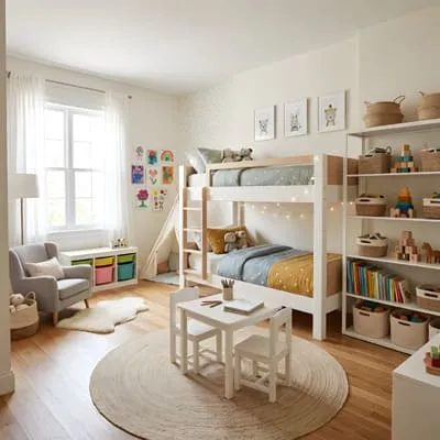
Position decor elements to guide the viewer’s eye naturally, avoiding overcrowding the frame.
Include architectural details such as windows, beams, or textures to contextualize the decor elements, emphasizing the space’s human-centered narrative. Keep styling minimalistic and purposeful, enhancing rather than distracting from the story.
Consistent framing and angles help build a recognizable visual identity on Instagram and Pinterest.
Post-Processing to Enhance Colour and Detail Accurately
- Adjust white balance for true-to-life colours
- Enhance shadows and highlights to add depth
- Maintain texture integrity without over-smoothing
- Crop thoughtfully to improve composition
- Use calibrated monitors to ensure colour accuracy
Post-processing should be subtle, reinforcing the natural beauty of the decor elements and colour palette. Over-editing can compromise authenticity and the architectural essence of the space.
Styling Tips to Organize and Highlight Decor Elements Effectively
Layering Elements for Depth and Interest
Layering decor elements adds dimension and narrative complexity to your images. Combine varied textures, heights, and colours to create visual depth without clutter. Group objects in odd numbers to maintain organic balance and use repetition to unify the composition.
This technique supports a slow, intentional style that reflects real-life living rather than staged decoration. It also allows climate-aware choices to shine, such as incorporating locally sourced items and seasonal plants.
Thoughtful layering enhances the architectural context by drawing attention to materiality and form.
Using Colour to Organize Visual Flow
Colour organizes the viewer’s journey through the photograph.
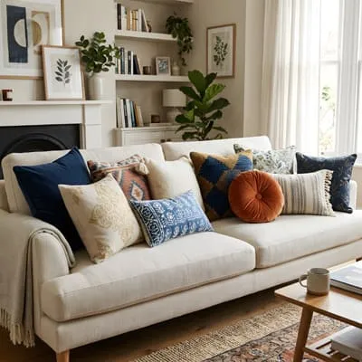
Use strategic placement of colour accents to lead the eye or highlight specific decor elements. comprehension drives engagement.
Gradients, tonal shifts, and contrast points create pathways that make images engaging and easy to scan.
Maintain a coherent palette throughout to avoid visual dissonance. Colour can also define zones within a room, helping to organize the decor elements spatially and conceptually.
This approach enhances clarity and performance on platforms like Pinterest, where quick visual
Comparing Styling Approaches for Different Room Types
| Room | Styling Focus | Colour Strategy |
|---|---|---|
| Living Room | Comfort and social areas | Warm neutrals with accent greens |
| Kitchen | Functionality and cleanliness | Bright whites and cool blues |
| Bedroom | Rest and relaxation | Soft pastels and muted earth tones |
This comparison highlights how organizing decor elements and colour shifts depending on room function and desired atmosphere, ensuring each space feels intentional and well-considered.
Colour Coordination Strategies for International and Climate-Aware Homes
Adapting Palettes to Regional Climate and Culture
Colour palettes should be informed by the local climate and cultural context to feel authentic and respectful. Warm, arid climates benefit from cool, reflective colours to mitigate heat, while cooler regions can embrace warmer tones to create coziness. Cultural symbolism also influences colour perception and should inform your choices.
This approach aligns decor elements with local traditions and environmental awareness, supporting sustainable and human-centered design principles.
International design sensibilities encourage mixing global influences with local context, creating unique, grounded interiors.
Integrating Sustainable Materials with Colour Choices
Sustainability goes hand in hand with climate-aware colour strategies. Choose decor elements made from eco-friendly materials that naturally complement your colour palette. Materials like bamboo, reclaimed wood, and organic textiles work well with earthy and muted tones, enhancing the overall narrative of responsible living.
This integration not only supports environmental goals but also creates a tactile, sensory experience that enriches home photography and styling.
Highlighting these sustainable choices through colour coordination adds depth to your storytelling on social media.
Benefits of a Calm and Intentional Colour Scheme
- Promotes psychological wellbeing and relaxation
- Enhances the perception of space and light
- Supports slow living and mindful consumption
- Increases versatility for seasonal updates
A calm, intentional colour scheme is essential for creating spaces that feel timeless and adaptable, perfectly suited for international audiences who appreciate architectural authenticity.
Organizing Colour and Decor Elements for Social Media Success
Optimizing Visual Flow for Instagram and Pinterest
Social media platforms demand images that are instantly engaging and easy to navigate visually. Organize colour and decor elements to create a clear focal point and balanced composition that guides the viewer’s eye naturally. Consistency in style and palette across posts builds brand recognition and trust.
Vertical formats work best on Pinterest, allowing you to showcase layered decor elements and colour gradients effectively. Instagram benefits from square or slightly vertical images with clean, architectural framing.
Use captions and hashtags that reinforce the calm, intentional lifestyle you promote through your visuals.
Tracking Performance and Adjusting Styling Strategies
Monitor engagement metrics like saves, shares, and comments to understand which combinations of decor elements and colour resonate most with your audience. Use A/B testing with different palettes or compositions to refine your approach over time.
Adjust your styling to emphasize high-performing elements and colour schemes while maintaining the overall architectural integrity and climate awareness that define your brand.
This data-driven approach ensures sustainable growth and meaningful connections with followers.
Comparing Engagement on Different Colour Palettes
| Colour Palette | Engagement Rate | Audience Feedback |
|---|---|---|
| Muted Earth Tones | 7.8% | Praised for warmth and authenticity |
| Bright Accents | 5.4% | Liked for vibrancy but sometimes overwhelming |
| Monochrome Neutrals | 6.9% | Appreciated for minimalism and calm |
Analyzing engagement helps tailor your organize, decor elements, and colour choices to maximize impact while staying true to your architectural and human-centered values.
Plan and Organize
Organizing your home decor and selecting decor elements and colour with intention is critical to producing authentic, architectural-quality photographs for Instagram and Pinterest. By focusing on calm, climate-aware design principles, you create images that resonate deeply with viewers seeking genuine living environments.
Incorporate these strategies thoughtfully to craft a cohesive visual language that supports slow, intentional living and highlights the beauty of your space. Embrace the art of organizing, decor elements, and colour to elevate your home styling and photography to new levels of expertise and engagement.
Frequently Asked Questions (FAQ)
How Do I Choose the Best Colour Palette for My Home Decor Photos?
Select a colour palette that reflects the mood you want to create, considering natural light, room function, and climate. Prioritize calm, muted tones with occasional accents for balance and authenticity.
What Are the Most Important Decor Elements to Highlight in Photography?
Focus on pieces that serve both functional and aesthetic purposes, like furniture, textiles, and natural materials. Highlight textures and shapes that convey a human-centered, architectural feel.
How Can I Organize My Space to Make Photos Look Less Cluttered?
Use negative space deliberately, group similar items, and rotate decor seasonally. Ensure a functional layout that supports flow and emphasizes key focal points in the frame.
What Lighting Conditions Work Best for Photographing Home Decor?
Soft, natural light during morning or late afternoon enhances colour accuracy and texture. Avoid direct harsh sunlight and use reflectors to balance shadows for a calm, intentional look.
How Can I Maintain a Consistent Style Across Instagram and Pinterest?
Stick to a defined colour palette, consistent composition techniques, and a calm, human-centered aesthetic. Regularly review engagement data to refine your approach and maintain authenticity.