
Last updated on September 14th, 2026 at 06:32 pm
Color influences human perception profoundly, especially within residential spaces where daily life unfolds. A color chart is a systematic arrangement of colors used to guide decisions about hues, tones, and combinations in various contexts. In home decor, understanding a color chart goes beyond picking favorites; it involves comprehending how colors interact with light, space, and human psychology to shape mood and functionality.
This article explores the psychology of color through the lens of a color chart, focusing on its architectural relevance in residential environments. It aims to provide a nuanced understanding that bridges technical knowledge with practical application, helping homeowners, designers, and architects make intentional, climate-aware color choices that enhance living spaces.
What You Need to Know About Color Charts and Home Decor
- A color chart organizes hues in a way that reveals relationships between colors, including complementary, analogous, and triadic schemes essential for balanced home interiors.
- Colors affect mood and behavior; for example, warm tones can energize a room, while cool tones promote calmness, a dynamic clearly illustrated by color chart groupings.
- Natural light and climate significantly influence how colors from a chart appear in a space, requiring adjustments based on geographic and architectural context.
- Using a color chart strategically supports sustainable design by reducing trial-and-error with paint and materials, minimizing waste and environmental impact.
- Not all color charts are created equal; variations in pigment, finish, and source can lead to discrepancies that must be accounted for during selection.
How the Color Chart Functions in Residential Design and Decoration
A color chart is a structured tool that categorizes colors based on attributes like hue, saturation, and brightness. In residential design, it serves as a roadmap for selecting palettes that harmonize with architectural elements and lifestyle needs. The chart typically arranges colors in a wheel or grid, illustrating primary, secondary, and tertiary colors along with their relationships. This visual guide aids in identifying complementary contrasts or subtle gradations to create desired atmospheres.
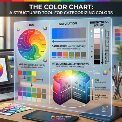
Practically, a color chart helps anticipate how colors will perform in different rooms, considering factors such as room size, ceiling height, and the type of natural light. For example, a north-facing room with cooler light may benefit from warmer colors on the chart to balance the ambiance. Architects and interior designers rely on these charts to ensure choices are intentional rather than arbitrary, promoting coherence and emotional resonance.
“A color chart is more than a palette; it’s a foundational instrument for translating psychological insights into spatial experiences.”
Psychological Effects of Colors on Residential Spaces Using a Color Chart
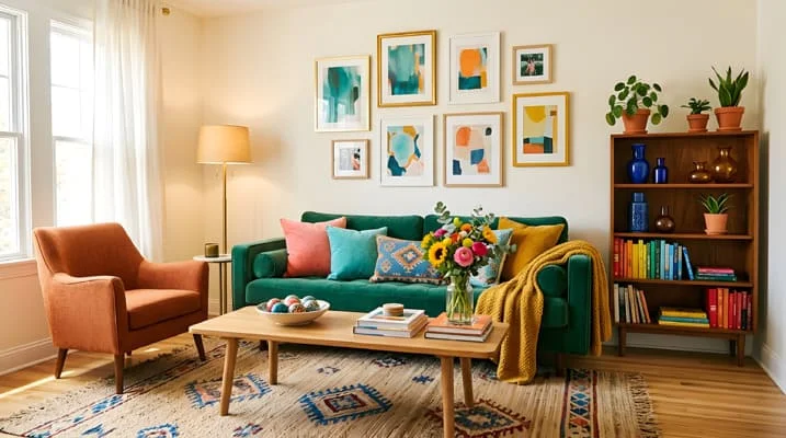
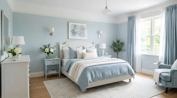
Colors evoke specific psychological responses that influence how residents feel and behave within their homes. A color chart categorizes these hues in ways that make it easier to select colors aligned with the intended mood of a space. For instance, blues and greens, often found clustered in cooler sections of the chart, are associated with tranquility and focus, making them ideal for bedrooms or study areas.
Conversely, reds and oranges stimulate energy and appetite, suitable for kitchens or social spaces. However, the psychological impact depends on saturation and brightness; a muted red may feel cozy, while a bright red can be overwhelming. Knowing these nuances allows for refined choices that accommodate both collective living and individual comfort.
“What distinguishes effective color use in homes is the conscious alignment of color psychology with the inhabitants’ daily rhythms and needs.”
Integrating Climate Awareness Into Color Chart Usage for Homes
Climate plays a pivotal role in how colors from a chart are perceived indoors. Regions with intense sunlight may require lighter, reflective colors to mitigate heat absorption, while cooler climates benefit from deeper, warmer tones to create a sense of warmth. .
A color chart becomes a dynamic tool when adjusted for these conditions rather than a rigid template.
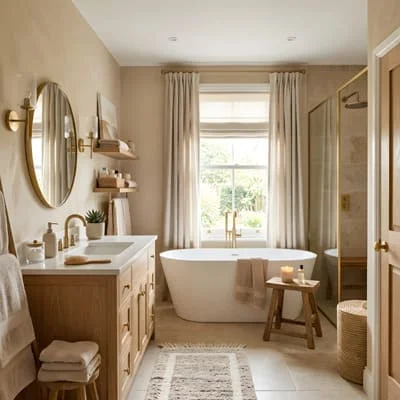
For instance, in a hot, sunny climate, a pale blue or soft beige from the chart can reduce glare and heat gain, while in a northern climate with limited sunlight, richer ochres or terracottas can add psychological warmth.
Architects must consider local climate data and seasonal variations, integrating them with color chart options to optimize comfort and energy efficiency
Practical Application: Using a Color Chart to Plan Sustainable and Human-Centered Interiors
Applying a color chart thoughtfully supports sustainability by minimizing unnecessary repainting and material waste. Selecting colors that harmonize with existing natural light and architectural features reduces the need for artificial lighting and climate control adjustments.
This intentionality aligns with a slow, mindful approach to home design that values longevity and well-being.
In practice, working with a color chart means testing samples in situ, observing changes throughout the day, and considering the psychological impact on all household members. For example, a living room painted using a carefully selected triadic scheme from the chart can balance stimulation and relaxation, catering to diverse activities while maintaining cohesive aesthetics.
- Use small swatches or digital renderings to preview chart colors under actual lighting conditions.
- Combine chart hues with natural materials like wood and stone to enhance tactile and visual harmony.
- Regularly revisit color choices, as personal and environmental factors may shift over time.
Limitations and Considerations When Relying on Color Charts for Home Decor
While color charts are invaluable, they have inherent limitations. Variations in paint formulations, finishes, and lighting can cause colors to appear differently than on the chart. Additionally, individual perception of color is subjective and culturally influenced, which means a color that soothes one person may unsettle another.
There is also debate among experts regarding the universality of color psychology effects, with some studies suggesting that context and personal experience often override general rules. Therefore, while a color chart provides a scientific and systematic starting point, it should be integrated with personal intuition and practical experimentation.
Understanding these nuances encourages a balanced approach: use the chart as a guide, not a strict prescription.
Frequently Asked Questions About (FAQ)
What is the Difference Between a Color Chart and a Color Palette?
A color chart is a comprehensive, often standardized visual arrangement of colors organized by hue, saturation, and brightness. It serves as a reference tool to understand color relationships and selection options. A color palette, on the other hand, is a curated subset of colors chosen for a specific project or purpose, often derived from a color chart. While the chart is broad and systematic, the palette is tailored and intentional.
How Does Natural Light Affect the Colors Chosen from a Color Chart?
Natural light changes throughout the day, affecting how colors appear indoors. North-facing rooms receive cooler, diffused light, which can make colors seem bluer or muted. South-facing rooms get warmer, direct sunlight, enhancing brightness and warmth. Colors from a chart may shift in tone or intensity depending on these lighting conditions, so testing colors in the actual environment is essential for accurate selection.
Can Color Charts Help in Creating a Sustainable Home Design?
Yes, color charts contribute to sustainable home design by enabling precise color selection that reduces waste from repainting and overbuying materials. Choosing colors suited to the climate and light conditions can also lower energy consumption by optimizing natural lighting and thermal comfort. This careful planning supports environmental goals alongside aesthetic and psychological needs.
Are Color Charts Universal, or Do They Vary by Manufacturer?
Color charts are not entirely universal; they can vary based on the manufacturer’s pigments, printing methods, and intended application. For instance, paint brands have proprietary color systems, so a red in one chart may differ slightly from another. It is important to use the specific color chart associated with the product or brand intended for use to ensure accuracy.
How Reliable is Color Psychology When Using a Color Chart for Home Interiors?
Color psychology offers valuable insights into how colors may influence mood and behavior, but it is not an exact science. Responses to color can vary widely based on individual experiences, cultural background, and context. A color chart helps apply these principles systematically, but personal preferences and practical testing should guide final decisions to ensure spaces feel comfortable and authentic.

Architect with extensive experience in residential and commercial design, including renovations and modular construction. Love to share information about Architecture, home and lifestyle in this blog.